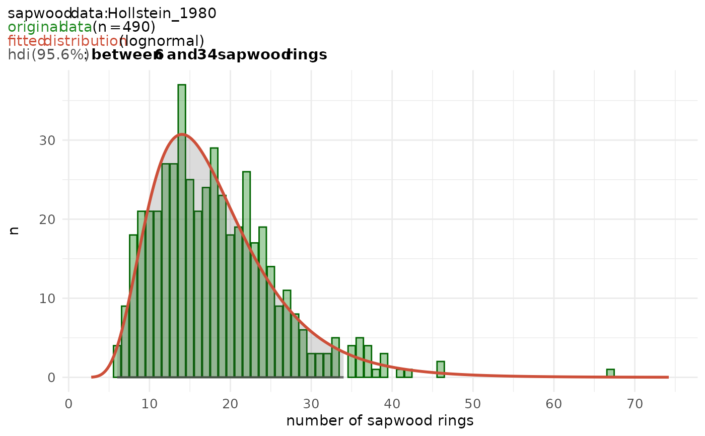
Returns a ggplot-style graph of the probability density function modelled to
a data set of observed sapwood numbers, as computed by sw_model().
Arguments
- x
Output of
sw_model().- bar_fill
Fill color for the bars (original data).
- bar_color
Line color for the bars (original data).
- line_color
Line color for the fitted distribution.
Examples
tmp <- sw_model(
     sw_data = "Hollstein_1980",
     densfun = "lognormal",
     cred_mass = .95,
     plot = FALSE
)
sw_model_plot(tmp,
     bar_fill = "forestgreen",
     bar_color = "darkgreen",
     line_color = "tomato3"
)

