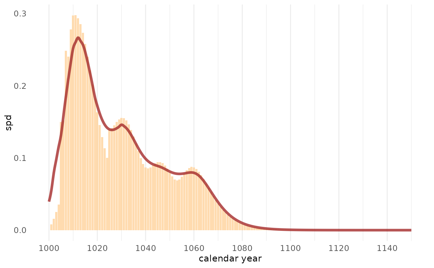
This function creates a visualization of the summed probability
density (SPD) output from sw_sum(). It displays both the SPD as a bar plot
and exact felling dates (waney edge series) as stacked points. A smoothing
spline is also added to reveal long-term trends in felling activity.
Usage
sw_sum_plot(
  x,
  bar_col = "steelblue",
  trend_col = "red3",
  dot_col = "steelblue4",
  dot_size = 2,
  dot_shape = 21,
  window_smooth = 11
)
Arguments
- x
A
data.frame, typically the output ofsw_sum()withplot = FALSE. Must contain columns"year"and"spd". If available,"spd_wk"(waney edge counts) will be used to add symbols representing exact felling years.- bar_col
Fill color for the SPD bars. Default is
"steelblue".- trend_col
Color of the smoothing spline line.
- dot_col
Fill color of the symbols representing exact felling dates (waney edge). Default is
"steelblue4".- dot_size
Size of the felling date symbols. Default is
2.- dot_shape
Shape code for the felling date symbols. See
?pointsfor options. Default is21(circle).- window_smooth
Numeric value specifying the smoothing window width (in years) for calculating the moving average trend line. Default is
11.
Value
A ggplot object showing:
The SPD as a bar plot.
A smoothing spline through the SPD.
Stacked symbols for exact felling years (waney edge), if available.
See also
sw_sum() to generate the SPD data.
Examples
sw_example6
#>   series last n_sapwood waneyedge
#> 1 trs_25 1000         5     FALSE
#> 2 trs_26 1009        10     FALSE
#> 3 trs_27 1007        15     FALSE
#> 4 trs_28 1005        16     FALSE
#> 5 trs_29 1010         8     FALSE
#> 6 trs_30 1020         0     FALSE
#> 7 trs_31 1025        10     FALSE
#> 8 trs_32 1050         3     FALSE
#> 9 trs_33 1035         1     FALSE
tmp <- sw_sum(sw_example6, plot = FALSE)
sw_sum_plot(tmp,
     bar_col = "burlywood1",
     trend_col = "brown",
     dot_col = "orange",
     dot_shape = 23, dot_size = 5
)