
Worked Example: Species Distribution
Stéphane Guillou
Source:vignettes/species-distribution.Rmd
species-distribution.RmdThis vignette demonstrates acquiring, processing and rudimentarily visualising the distribution of Colibri species.
Acquire data
The query uses the quality = "research" parameter to
focus on more reliable data (i.e. observations that have been identified
as the same taxon by several iNaturalist contributors, of animals that
are not in captivity).
library(rinat)
colibri <- get_inat_obs(taxon_name = "Colibri",
                        quality = "research",
                        maxresults = 1000)
Which species are listed?
Prepare the data
We can process the data to merge the subspecies into the corresponding species, and remove rows with missing coordinates. Parsing the date and time of observation can also be useful.
Visualise
A histogram can be useful to get an idea of the range of dates.
library(ggplot2)
ggplot(col_sp, aes(x = datetime)) +
  geom_histogram()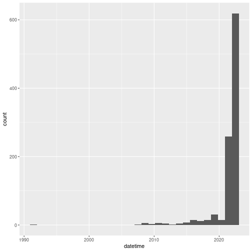
Expectedly, observations are mostly recent. Although earlier observations can be submitted, iNaturalist was launched in 2008, which means the vast majority of the observations are from after 2008.
Let’s now visualise the observations’ locations with ggplot2.
ggplot(data = col_sp, aes(x = longitude,
                         y = latitude,
                         colour = scientific_name)) +
  geom_polygon(data = map_data("world"),
                   aes(x = long, y = lat, group = group),
                   fill = "grey95",
                   color = "gray40",
                   size = 0.1) +
  geom_point(size = 0.7, alpha = 0.5) +
  # this guarantees the map is not stretched
  coord_fixed(xlim = range(col_sp$longitude),
              ylim = range(col_sp$latitude)) +
  theme_bw()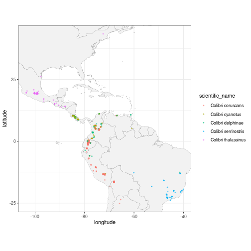
Using ggforce’s geom_mark_*() functions, we can
highlight and annotate the different species directly on the plot. We
expand the x and y axes limits to make space for the additions.
# define expansion factors for giving space to ellipses and labels
exp_fact <- c(0.5, 0.5)
library(ggforce)
ggplot(data = col_sp, aes(x = longitude,
                         y = latitude,
                         colour = scientific_name)) +
  geom_polygon(data = map_data("world"),
                   aes(x = long, y = lat, group = group),
                   fill = "grey95",
                   color = "gray40",
                   size = 0.1) +
  geom_point(size = 0.7, alpha = 0.5) +
  # annotate with a hulls and labels
  geom_mark_hull(aes(label = scientific_name,
                     fill = scientific_name),
                 expand = unit(1, "mm"),
                 radius = unit(1, "mm"),
                 label.fill = "transparent") +
  # expand axes here
  scale_x_continuous(expand = exp_fact) +
  scale_y_continuous(expand = exp_fact) +
  coord_fixed(xlim = range(col_sp$longitude),
              ylim = range(col_sp$latitude)) +
  theme_bw() +
  # remove the superfluous legend
  theme(legend.position = "none")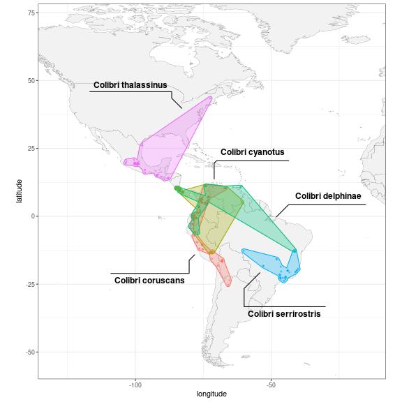
Remove outliers
Some observations could have been misidentified, misplaced, or simply
be an exception that is not representative of the common range of the
species. One way to remove these outliers could be to compute for each
observation the distance to the nearest other observation belonging to
the same species. For that, we first convert to an sf
object, split it into separate species, and use the functions
st_nearest_feature() to identify the closest feature and
st_distance() to compute the distance.
library(sf)
library(purrr)
col_dist <- col_sp %>%
  st_as_sf(coords = c("longitude", "latitude"), crs = "WGS84") %>%
  split(.$scientific_name) %>%
  map_dfr(~ mutate(.x,
                   nearest_id = st_nearest_feature(.x),
                   nearest = geometry[nearest_id],
                   dist_nearest = st_distance(geometry, nearest, by_element = TRUE)))
Let’s highlight the observations that are at least 1000 km away from another observation of the same species:
ggplot(data = col_dist, aes(colour = scientific_name)) +
  geom_sf() +
  geom_sf(data = col_dist %>% filter(as.integer(dist_nearest) > 1e6),
          colour = "red", size = 5, shape = 1)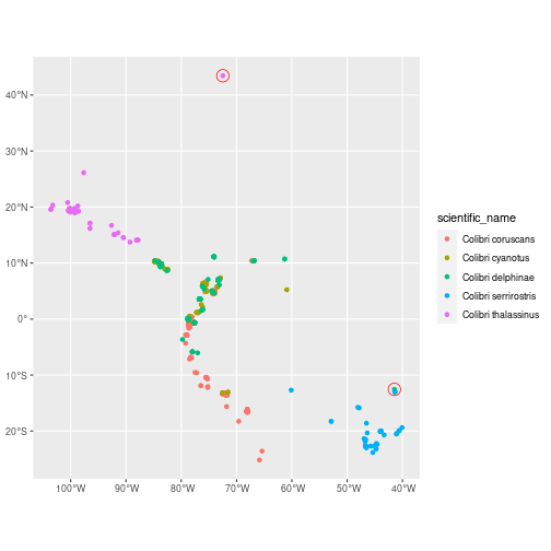
We can now reuse the same visualisation code as before, with the outliers filtered out:
col_clean <- col_sp %>%
  anti_join(col_dist %>% filter(as.integer(dist_nearest) > 1e6),
            by = "id") # filter outliers out
ggplot(col_clean, aes(x = longitude, y = latitude,
             colour = scientific_name)) +
  geom_polygon(data = map_data("world"),
                   aes(x = long, y = lat, group = group),
                   fill = "grey95",
                   color = "gray40",
                   size = 0.1) +
  geom_point(size = 0.7, alpha = 0.5) +
  geom_mark_hull(aes(label = scientific_name,
                     fill = scientific_name),
                 expand = unit(1, "mm"),
                 radius = unit(1, "mm"),
                 label.fill = "transparent") +
  scale_x_continuous(expand = exp_fact) +
  scale_y_continuous(expand = exp_fact) +
  coord_fixed(xlim = range(col_clean$longitude),
              ylim = range(col_clean$latitude)) +
  theme_bw() +
  theme(legend.position = "none")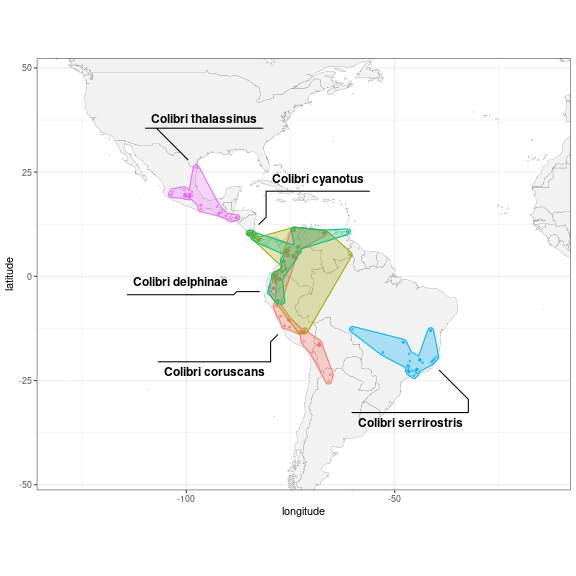
Note that this outlier detection method will not always be useful. For example, one outlier specimen could have been recorded in several separate observations, and therefore wouldn’t be filtered out based on distance.