Returns a ggplot-style graph of the probability density function for the
felling date range, as computed by sw_interval().
Arguments
- x
Output of
sw_interval()withhdi = FALSE.- area_fill
Fill color for the area under fitted distribution.
- line_color
Line color for the fitted distribution.
Value
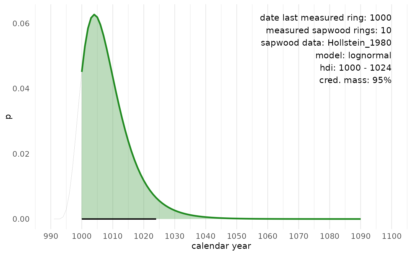
A ggplot-style graph, with calendar years on the X-axis and the probability (p) on the Y-axis.
Examples
tmp <- sw_interval(
     n_sapwood = 10,
     last = 1000,
     hdi = FALSE,
     cred_mass = .95,
     sw_data = "Hollstein_1980",
     densfun = "lognormal",
     plot = FALSE
)
sw_interval_plot(tmp, area_fill = "forestgreen", line_color = "forestgreen")