Summarising results from predictNMB
Source:vignettes/summarising-results-with-predictNMB.Rmd
summarising-results-with-predictNMB.RmdThis vignette is purely about how to use the autoplot()
method and summary() to visualise and summarise the
simulations made using predictNMB. For an introduction to
predictNMB, please see the introductory
vignette.
Firstly, as an example case, we will prepare our sampling functions
and run screen_simulation_inputs().
get_nmb_sampler_training <- get_nmb_sampler(
  wtp = 28033,
  qalys_lost = function() rnorm(n = 1, mean = 0.0036, sd = 0.0005),
  high_risk_group_treatment_cost = function() rnorm(n = 1, mean = 20, sd = 3),
  high_risk_group_treatment_effect = function() rbeta(n = 1, shape1 = 40, shape2 = 60),
  use_expected_values = TRUE
)

get_nmb_sampler_evaluation <- get_nmb_sampler(
  wtp = 28033,
  qalys_lost = function() rnorm(n = 1, mean = 0.0036, sd = 0.0005),
  high_risk_group_treatment_cost = function() rnorm(n = 1, mean = 20, sd = 3),
  high_risk_group_treatment_effect = function() rbeta(n = 1, shape1 = 40, shape2 = 60)
)
cl <- makeCluster(2)
sim_screen_obj <- screen_simulation_inputs(
  n_sims = 500,
  n_valid = 10000,
  sim_auc = seq(0.7, 0.95, 0.05),
  event_rate = c(0.1, 0.2),
  fx_nmb_training = get_nmb_sampler_training,
  fx_nmb_evaluation = get_nmb_sampler_evaluation,
  cutpoint_methods = c("all", "none", "youden", "value_optimising"),
  cl = cl
)
stopCluster(cl)
Making plots with predictNMB
Plotting the results from
screen_simulation_inputs()
Choosing the x-axis variable and other constants
In this simulation screen, we vary both the event rate and the model
discrimination (sim_AUC). There are many ways that we could visualise
the data. The autoplot() function allows us to make some
basic plots to compare the impact of different cutpoint methods on Net
Monetary Benefit (NMB) and another variable of our choice.
In this case, we can visualise the impact on NMB for different
methods across varying levels of sim_auc or
event_rate. We control this with the
x_axis_var argument.
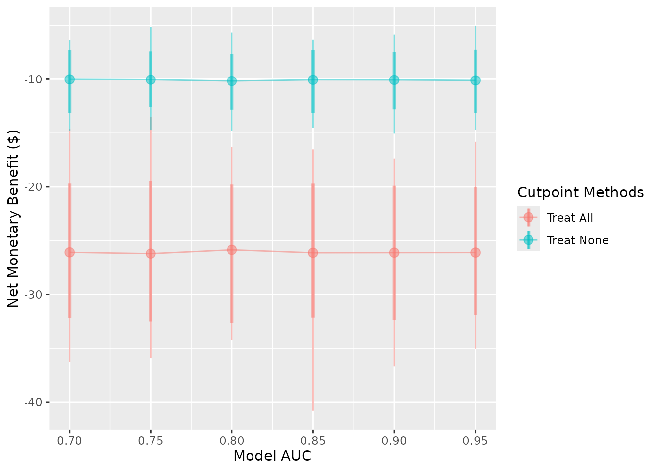
autoplot(sim_screen_obj, x_axis_var = "sim_auc")
#>
#>
#> Varying simulation inputs, other than sim_auc, are being held constant:
#> event_rate: 0.1
To avoid the overlap of points in this second plot, which visualises
NMB at varying event rates, we can specify the dodge_width
to be non-zero.
autoplot(sim_screen_obj, x_axis_var = "event_rate", dodge_width = 0.002)
#>
#>
#> Varying simulation inputs, other than event_rate, are being held constant:
#> sim_auc: 0.7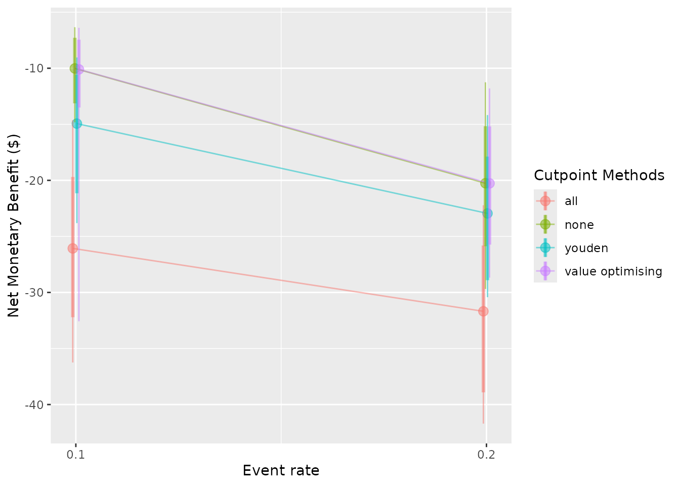
For these plots, one of the screened inputs will be the x-axis
variable, but the other will only be displayed at a single level. For
example, if we are looking at outcomes over a range of AUC values, the
prevalence will be fixed. The default setting for this second input will
assume the first level, so when we visualise the change in NMB
specifying sim_auc as the x-axis variable, we only observe
this for the case where event_rate = 0.1. We can choose to
select another level with the constants argument. This
argument expects a named list containing the values to keep for the
screened inputs which are not shown on the x-axis.
autoplot(sim_screen_obj, x_axis_var = "sim_auc", constants = list(event_rate = 0.1))
#>
#>
#> Varying simulation inputs, other than sim_auc, are being held constant:
#> event_rate: 0.1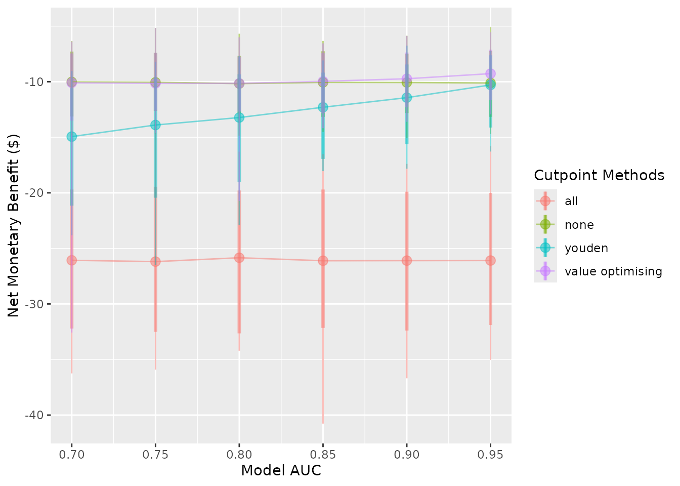
autoplot(sim_screen_obj, x_axis_var = "sim_auc", constants = list(event_rate = 0.2))
#>
#>
#> Varying simulation inputs, other than sim_auc, are being held constant:
#> event_rate: 0.2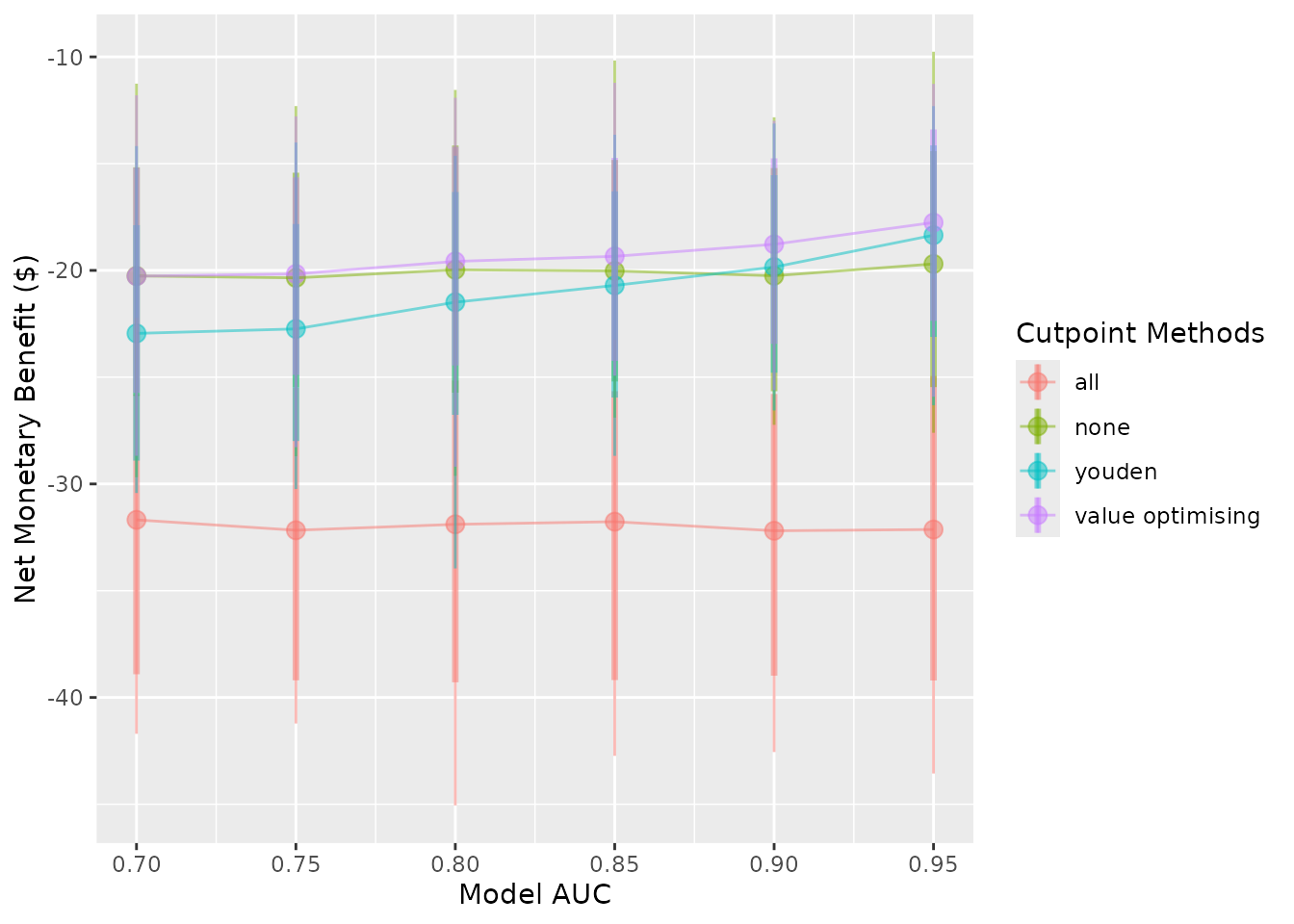
We see both a change to the plot as well as the message produced when the plot is made.
Choosing a y-axis variable
There are three options for the y-axis. The default is the NMB, but
you can also visualise the Incremental Net Monetary Benefit (INB) and
the selected cutpoints. These are controlled by the what
argument, which can be any of c("nmb", "inb", "cutpoints").
If a vector is used, only the first value will be selected. If you
choose to visualise the INB, you must list your chosen reference
strategy for the calculation in the inb_ref_col. In this
case, we use treat-all ("all").
autoplot(sim_screen_obj, what = "nmb")
autoplot(sim_screen_obj, what = "inb", inb_ref_col = "all")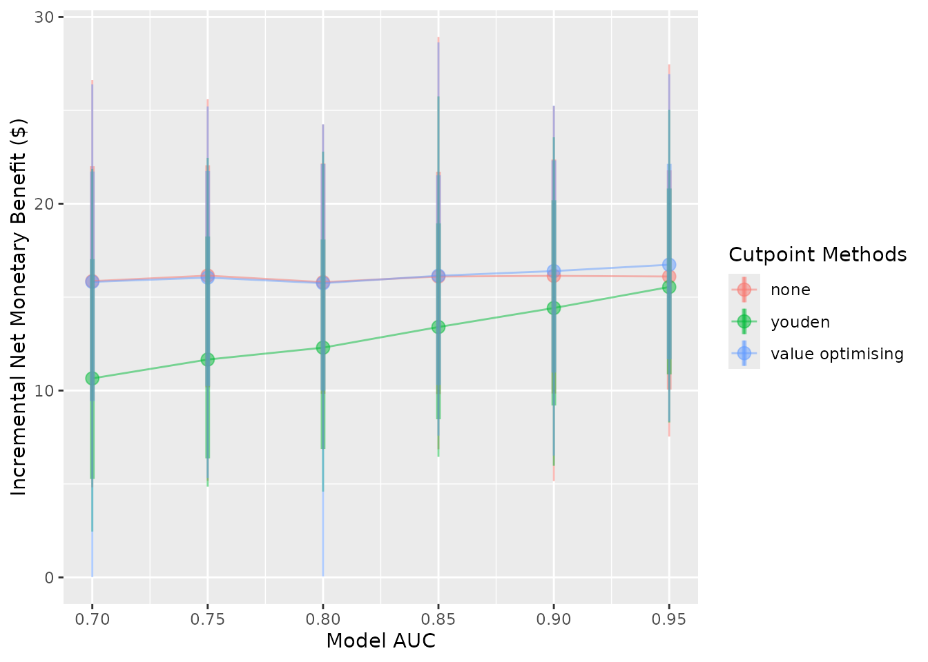
autoplot(sim_screen_obj, what = "cutpoints")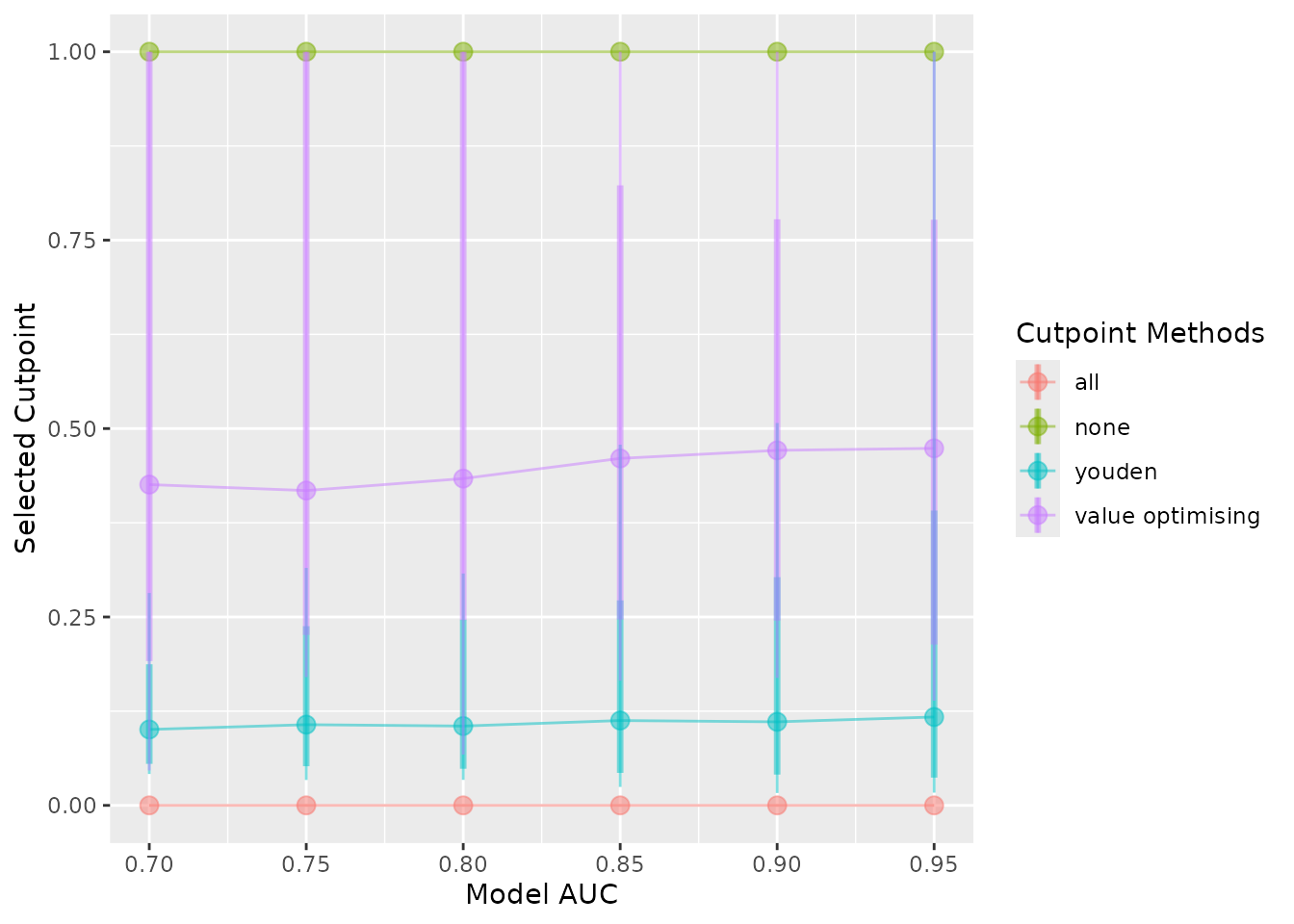
Selecting what to show on the plot
The plots show the median (the dot), the 95% confidence interval
(thick vertical lines), the range (thin vertical lines), and the lines
between the points by default. These can each be shown or hidden
independently, and the width of the confidence interval can be
controlled using the plot_conf_level argument.
autoplot(sim_screen_obj)
autoplot(sim_screen_obj, plot_range = FALSE)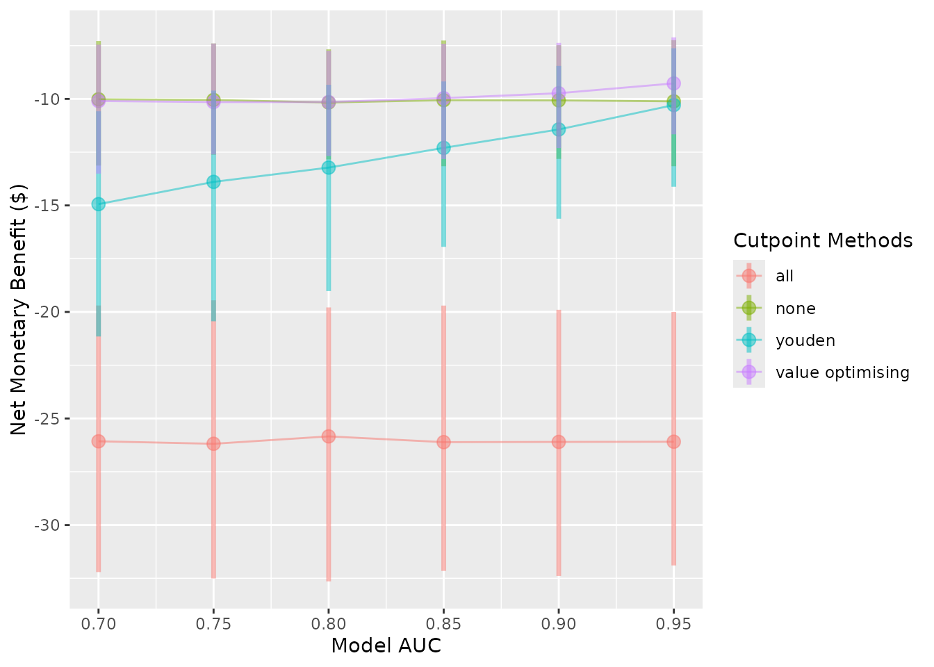
autoplot(sim_screen_obj, plot_conf_level = FALSE)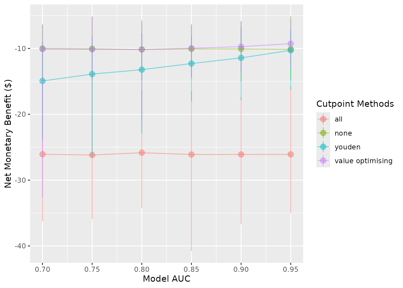
autoplot(sim_screen_obj, plot_conf_level = FALSE, plot_range = FALSE)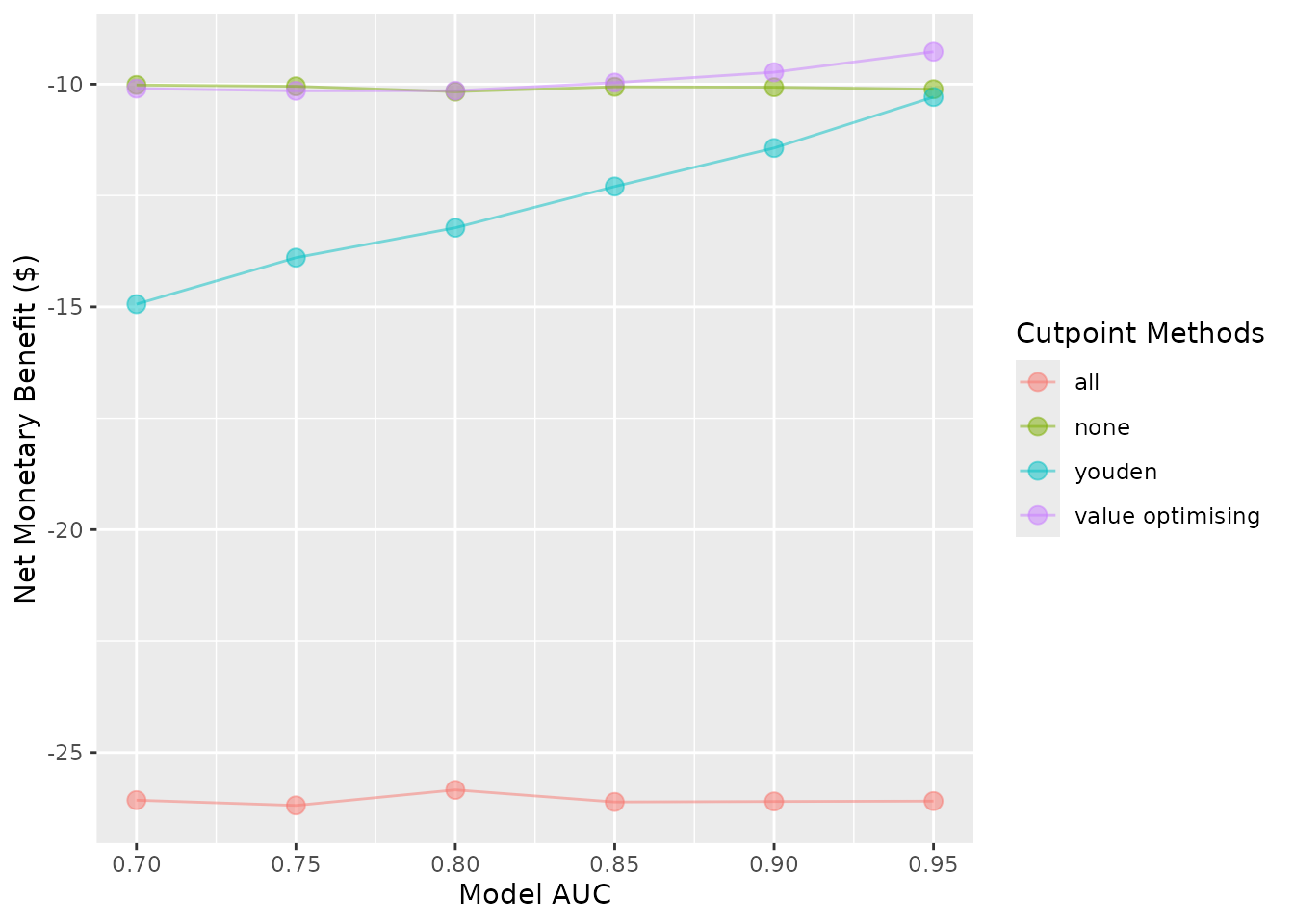
autoplot(sim_screen_obj, plot_conf_level = FALSE, plot_range = FALSE, plot_line = FALSE)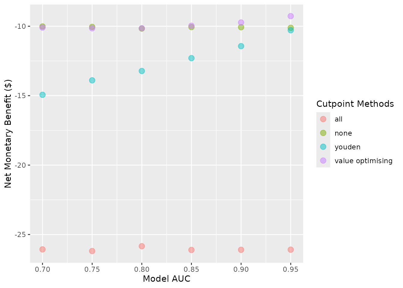
Other plot modifications
Currently, the lines and dots overlap. We can use
dodge_width to apply a horizontal dodge for all layers.
autoplot(sim_screen_obj, dodge_width = 0.01)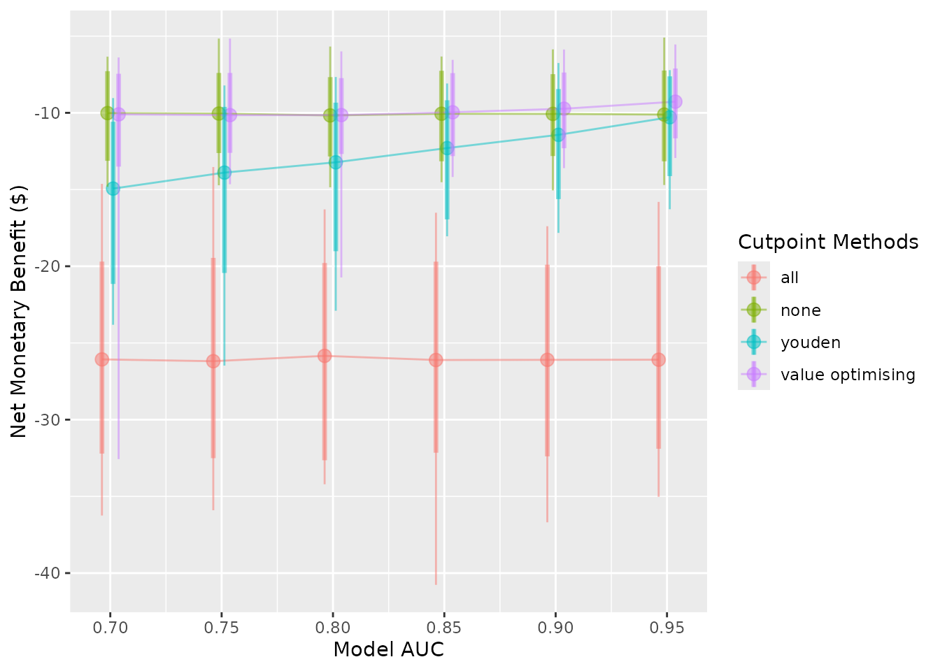
The cutpoint methods can be renamed or removed. To rename them, pass
a named vector to the rename_vector argument. The names of
the vector are the new names and the values are the names you wish to
replace.
autoplot(
  sim_screen_obj,
  rename_vector = c("Treat All" = "all",
                    "Treat None" = "none",
                    "Youden Index" = "youden",
                    "Value Optimisation" = "value_optimising")
)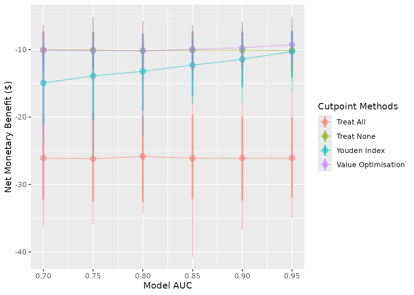
You can reorder the methods by passing the order as the
methods_order argument. Also note that this will remove all
methods which aren’t included, and it will factor the names AFTER it has
renamed them. So, if you are both renaming and re-ordering, you must
provide the updated names when you order them:
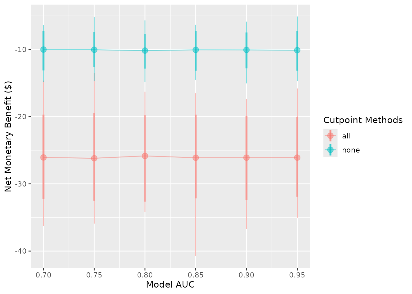
autoplot(
  sim_screen_obj,
  # Assign new names to the two methods of interest
  rename_vector = c("Treat All" = "all", "Treat None" = "none"),

  # Call the methods by their new names
  methods_order = c("Treat All", "Treat None")
)
The transparency of all layers can be controlled with
plot_alpha.
autoplot(sim_screen_obj, plot_alpha = 0.2)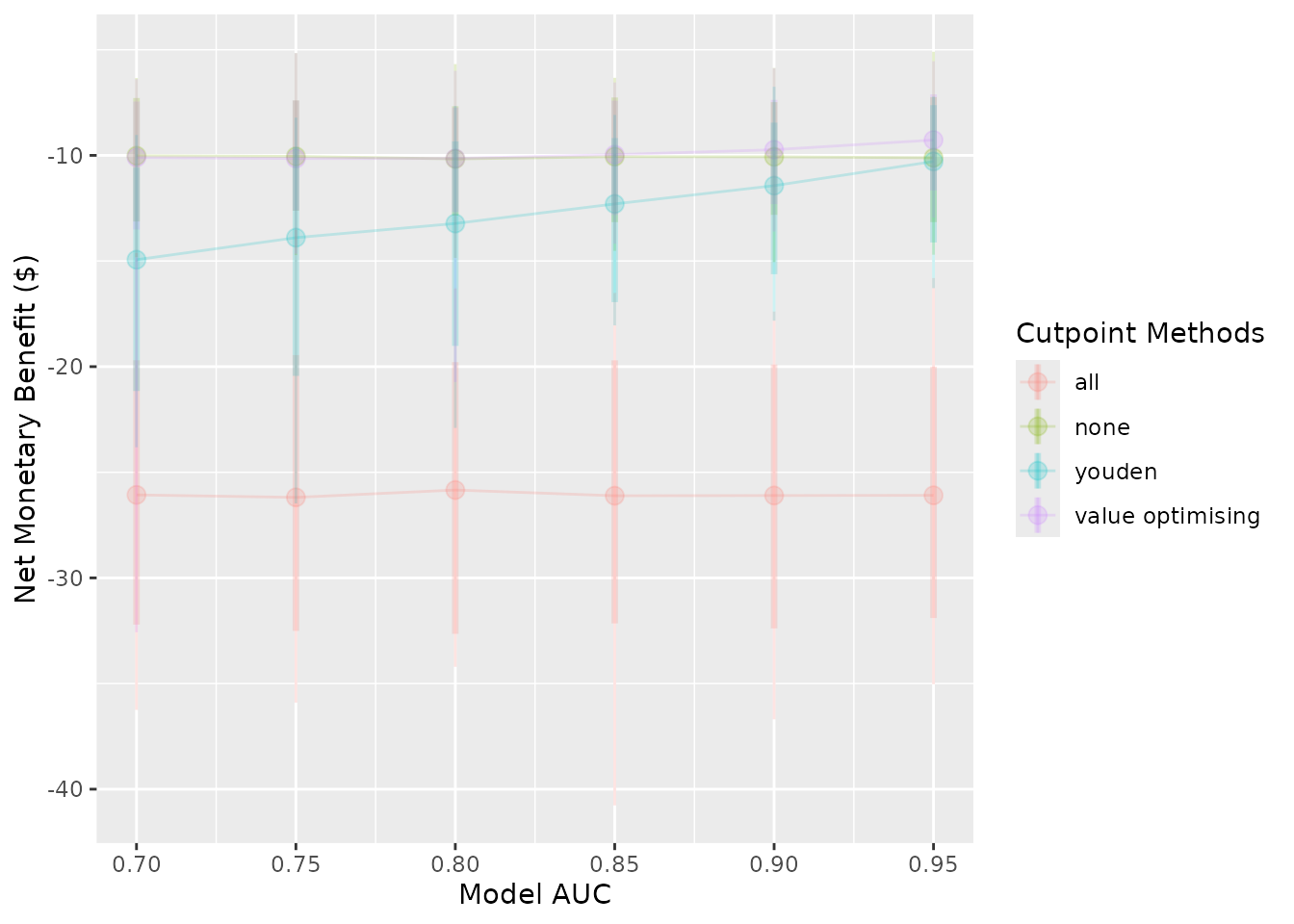
autoplot(sim_screen_obj, plot_alpha = 1)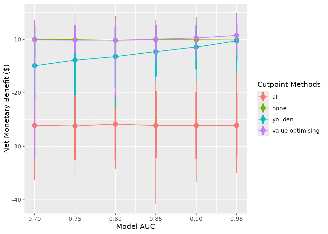
Plotting the results from do_nmb_sim()
Many of the same arguments that we used above can be used with the
object returned from do_nmb_sim()
do_nmb_sim_obj <- do_nmb_sim(
  n_sims = 500,
  n_valid = 10000,
  sim_auc = 0.7,
  event_rate = 0.1,
  fx_nmb_training = get_nmb_sampler_training,
  fx_nmb_evaluation = get_nmb_sampler_evaluation,
  cutpoint_methods = c("all", "none", "youden", "value_optimising")
)
autoplot()
The plots here show the results of a single simulation and compare the available cutpoints.

The y-axis variable and names and orders of methods can be controlled in the same way as previously:
autoplot(
  do_nmb_sim_obj,
  what = "inb",
  inb_ref_col = "all",
  rename_vector = c(
    "Value-Optimising" = "value_optimising",
    "Treat-None" = "none",
    "Youden Index" = "youden"
  )
) + theme_sim()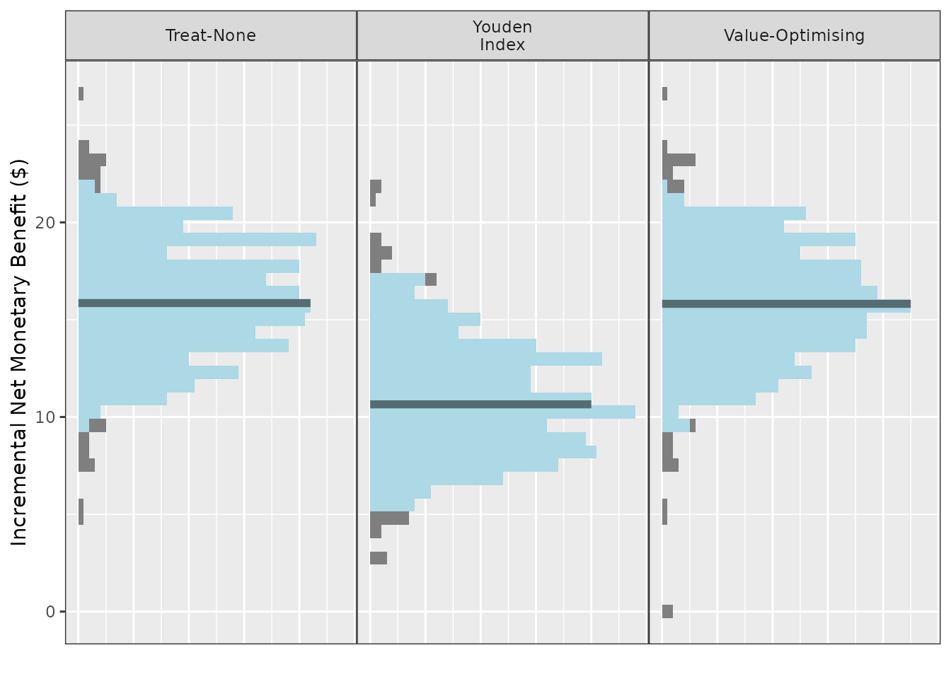
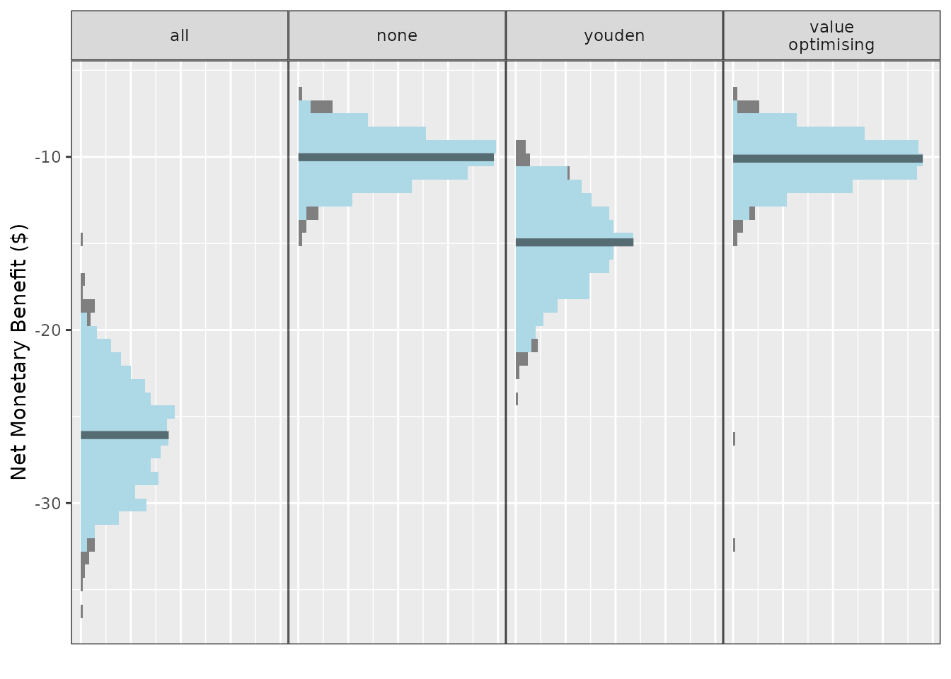
autoplot(
  do_nmb_sim_obj,
  what = "cutpoints",
  methods_order = c("all", "none", "youden", "value optimising")
) + theme_sim()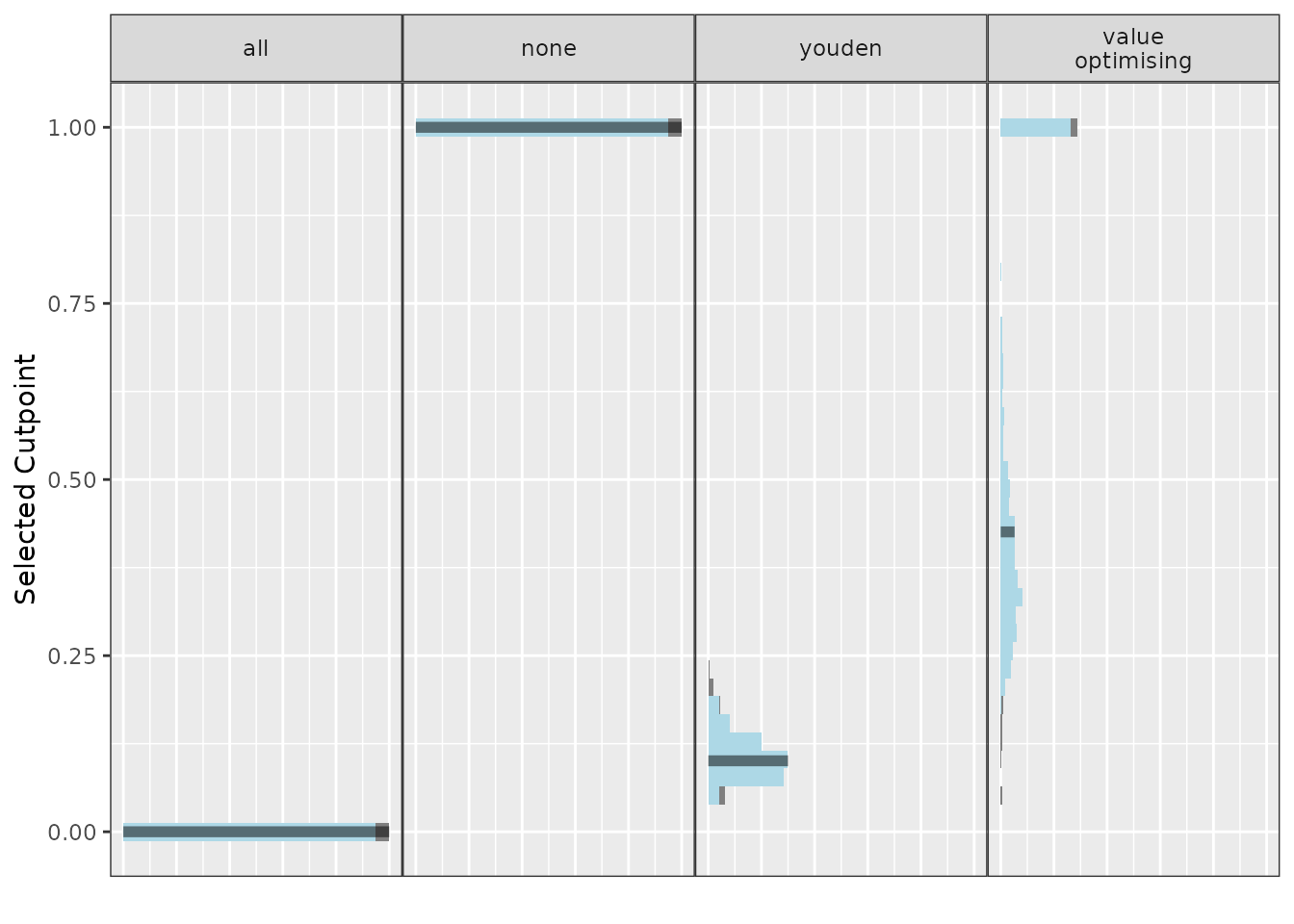
These plots display the median as the solid bar, the grey part of the
distributions are the outer 5% of the simulated values and the light
blue region is the 95% CI. For the methods that select thresholds based
on the values in the 2x2 table, including the value-optimising
thresholds, this may look a little strange as the cutpoints are highly
variable. This can be stabilised with more simulations. The fill colours
of the histogram are controlled with fill_cols and the line
for the median is controlled with median_line_col. The
thickness of the median line is controlled with
median_line_size and its transparency with
median_line_alpha.
autoplot(
  do_nmb_sim_obj,
  fill_cols = c("red", "blue"),
  median_line_col = "yellow",
  median_line_alpha = 1,
  median_line_size = 0.9
) + theme_sim()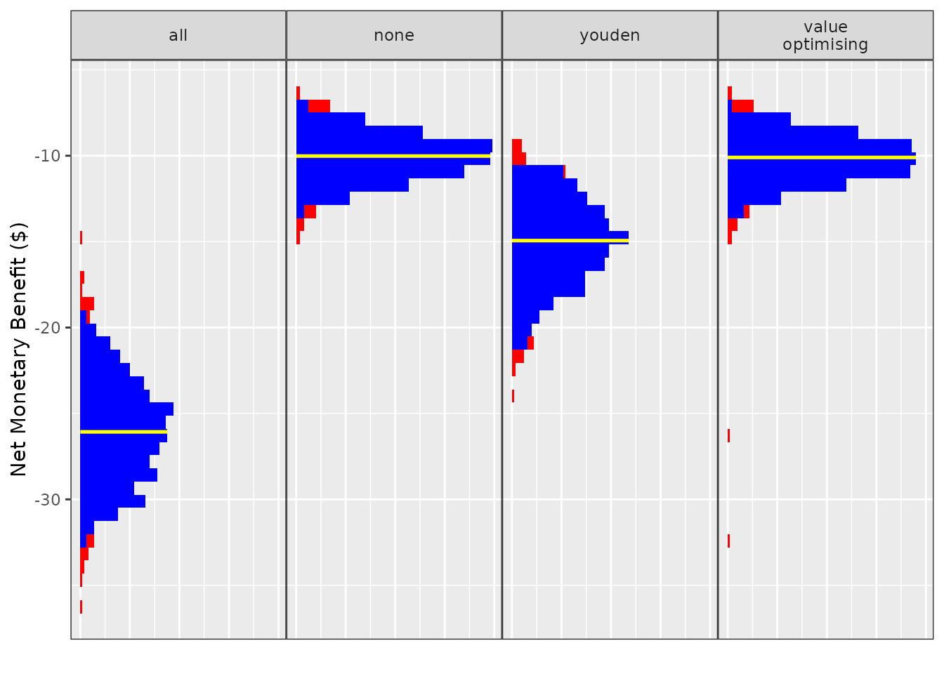
The n_bins argument controls the number of bins used for
the histograms and the label_wrap_width is the number of
characters above which to start a new line for the facet labels. This
can be handy when using detailed names for the methods when the font of
the label is relatively large compared to the plot, though a space is
needed to determine where to split the label. The width of the
confidence intervals can also be controlled by the
conf.level argument in this autoplot()
call.
autoplot(
  do_nmb_sim_obj,
  n_bins = 15,
  rename_vector = c(
    "Value- Optimising" = "value_optimising",
    "Treat- None" = "none",
    "Treat- All" = "all",
    "Youden Index" = "youden"
  ),
  label_wrap_width = 5,
  conf.level = 0.8
) + theme_sim()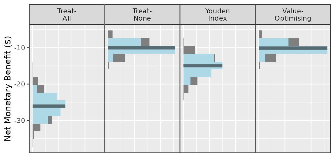
ce_plot()
A cost-effectiveness plot may be useful to decision-makers deciding between competing alternatives as it shows both the incremental healthcare costs associated with the change as well as the incremental improvement in patient benefit (QALYs). For a detailed explanation on how to interpret cost-effectiveness plots, see (Fenwick et al. 2006).
For these plots, a reference group must be specified with
ref_col. In this example, the reference group is to treat
none.
ce_plot(do_nmb_sim_obj, ref_col = "none")
#> Ignoring unknown labels:
#> • shape : "list(`NA` = NULL)"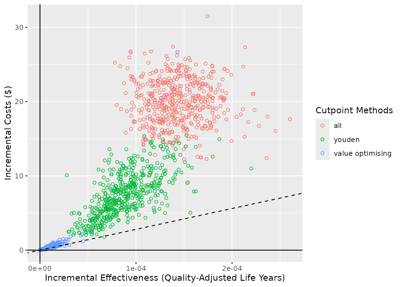
Similarly to autoplot(), the methods can be selected and
renamed using methods_order and rename_vector.
The diagonal line is the cost-effectiveness plane and this is based on
the willingness to pay. In this example, it was $28033 and is stored
within the predictNMBsim object via the
fx_nmb_evaluation function that was originally used.
Simulations underneath the cost-effectiveness plane are deemed
cost-effective.
attr(do_nmb_sim_obj$meta_data$fx_nmb_evaluation, "wtp")
#> [1] 28033
The WTP can be adjusted using the WTP argument but it is not
advisable to use a different value to what was used in the initial
simulations because the plotted WTP will be different to the simulation
objects. If a different WTP value should be investigated, it is
advisable to re-run the simulations again as do_nmb_sim
objects.
ce_plot(do_nmb_sim_obj, ref_col = "none", wtp = 100000)
#> wtp is stored in predictNMBsim object (wtp = 28033)
#>
#> but has also been specified (wtp = 1e+05)
#>
#> Using a different WTP for evaluating the simulations (NMB) and within the cost-effectiveness plot may lead to misinterpretation!
#> Ignoring unknown labels:
#> • shape : "list(`NA` = NULL)"
The line can be removed by using show_wtp = FALSE.
ce_plot(do_nmb_sim_obj, ref_col = "none", show_wtp = FALSE)
#> Ignoring unknown labels:
#> • shape : "list(`NA` = NULL)"
The shape argument controls the shape aesthetic in
geom_point(). It can also be mapped to whether the point is
“cost-effective” (falls beneath the cost-effectiveness plane/WTP line)
or the cutpoint “method”, and the proportion of cost-effective
simulations can be added to the methods section of the legend if
add_prop_ce = TRUE. For the sake of demonstration, we’ll
change the WTP line for the “cost-effective” shape input.
ce_plot(do_nmb_sim_obj, ref_col = "none", shape = 15, add_prop_ce = TRUE)
#> Ignoring unknown labels:
#> • shape : "list(`NA` = NULL)"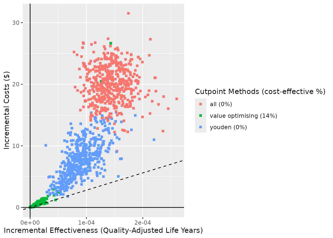
ce_plot(do_nmb_sim_obj, ref_col = "none", shape = "square", add_prop_ce = TRUE)
#> Ignoring unknown labels:
#> • shape : "list(`NA` = NULL)"
ce_plot(do_nmb_sim_obj, ref_col = "none", shape = "cost-effective", wtp = 80000, add_prop_ce = TRUE)
#> wtp is stored in predictNMBsim object (wtp = 28033)
#>
#> but has also been specified (wtp = 80000)
#>
#> Using a different WTP for evaluating the simulations (NMB) and within the cost-effectiveness plot may lead to misinterpretation!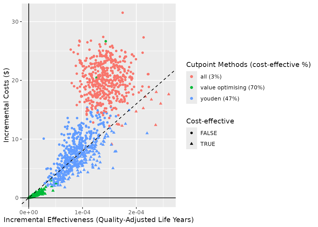
ce_plot(do_nmb_sim_obj, ref_col = "none", shape = "method", add_prop_ce = TRUE)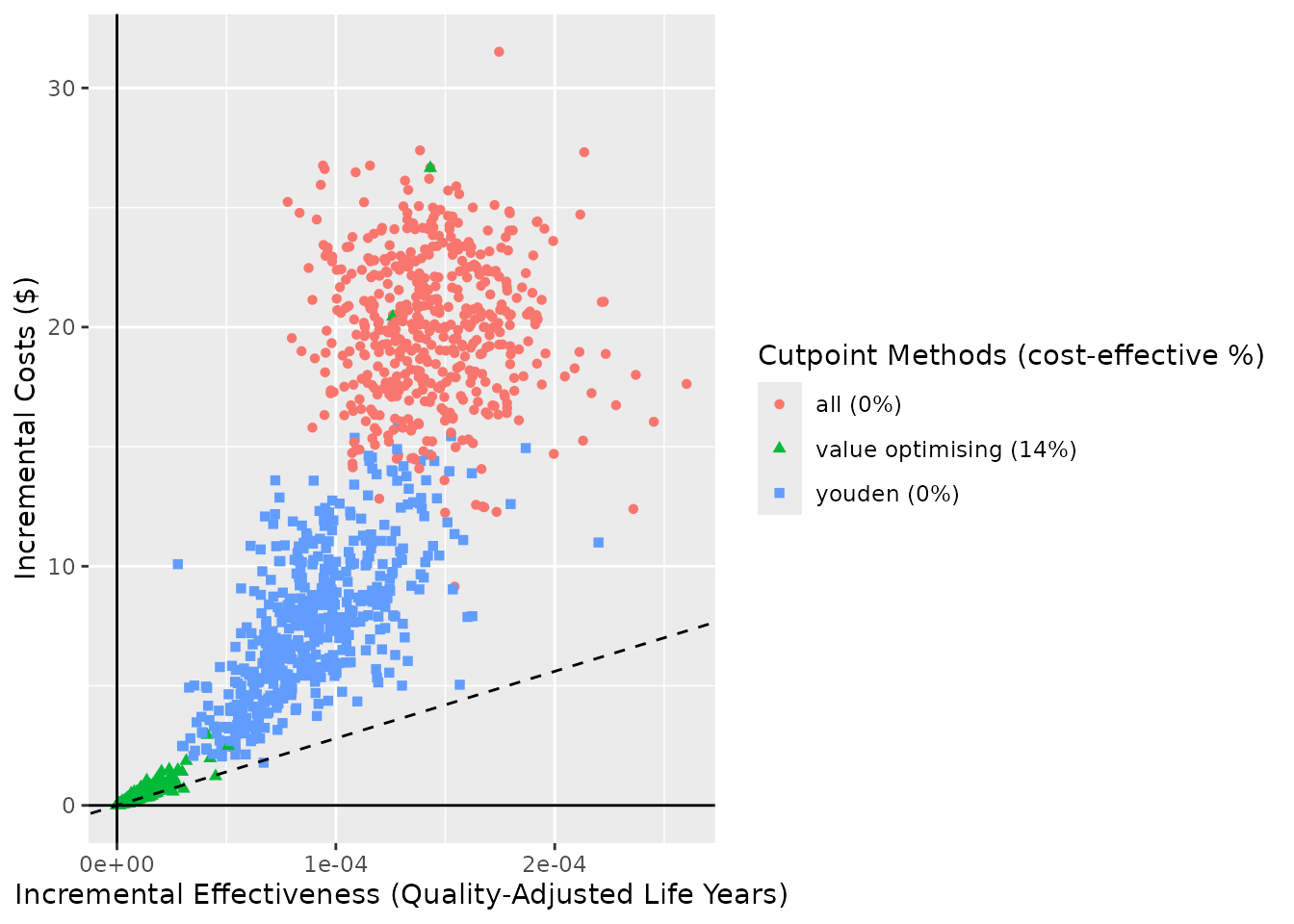
If you want the method to be mapped to shape but not colour, then,
just as with any ggplot object, you can adjust the values
on the returned plot with
ggplot2::scale_color_manual().
ce_plot(do_nmb_sim_obj, ref_col = "none", shape = "method") +
  ggplot2::scale_color_manual(values = rep("black", 3))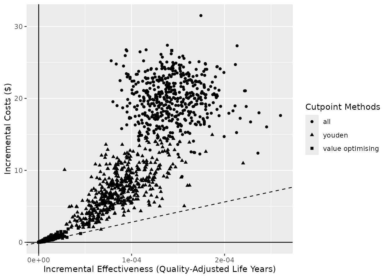
Making tables with predictNMB
To make tables from the same objects as we used for the plots, we
instead use summary(). This can be applied to either type
of object (screen_simulation_inputs() or
do_nmb_sim()). Using the %>% (or
|>) operator, we can pass it straight to
flextable() from the flextable package that
we have already loaded.
summary(sim_screen_obj)sim_auc |
event_rate |
all_median |
all_95% CI |
none_median |
none_95% CI |
youden_median |
youden_95% CI |
value optimising_median |
value optimising_95% CI |
|---|---|---|---|---|---|---|---|---|---|
0.70 |
0.1 |
-26.07 |
-32.2 to -19.6 |
-10.02 |
-13 to -7.3 |
-14.94 |
-21.1 to -10.6 |
-10.10 |
-13.4 to -7.4 |
0.70 |
0.2 |
-31.68 |
-38.9 to -25.8 |
-20.26 |
-25.9 to -15 |
-22.95 |
-28.9 to -17.9 |
-20.27 |
-25.7 to -15.2 |
0.75 |
0.1 |
-26.19 |
-32.4 to -19.4 |
-10.05 |
-12.6 to -7.4 |
-13.90 |
-20.3 to -9.6 |
-10.15 |
-12.6 to -7.4 |
0.75 |
0.2 |
-32.17 |
-39.2 to -25.5 |
-20.35 |
-25.5 to -15.4 |
-22.74 |
-28 to -17.8 |
-20.16 |
-24.9 to -15.6 |
0.80 |
0.1 |
-25.84 |
-32.6 to -19.8 |
-10.17 |
-12.8 to -7.6 |
-13.22 |
-19 to -9.3 |
-10.15 |
-12.6 to -7.7 |
0.80 |
0.2 |
-31.89 |
-39.2 to -25.1 |
-19.97 |
-25.7 to -14.1 |
-21.49 |
-26.7 to -16.3 |
-19.58 |
-24.4 to -14.2 |
0.85 |
0.1 |
-26.11 |
-32.1 to -19.6 |
-10.06 |
-13.2 to -7.2 |
-12.30 |
-16.9 to -9.2 |
-9.97 |
-12.8 to -7.4 |
0.85 |
0.2 |
-31.77 |
-39.2 to -25.6 |
-20.02 |
-25.2 to -14.8 |
-20.70 |
-25.9 to -16.2 |
-19.34 |
-24.2 to -14.7 |
0.90 |
0.1 |
-26.10 |
-32.4 to -19.9 |
-10.07 |
-12.8 to -7.5 |
-11.43 |
-15.6 to -8.4 |
-9.73 |
-12.3 to -7.4 |
0.90 |
0.2 |
-32.19 |
-38.9 to -25.7 |
-20.25 |
-25.6 to -15.2 |
-19.84 |
-24.8 to -15.5 |
-18.78 |
-23.3 to -14.7 |
0.95 |
0.1 |
-26.09 |
-31.9 to -20 |
-10.11 |
-13.2 to -7.2 |
-10.29 |
-14.1 to -7.6 |
-9.27 |
-11.6 to -7.1 |
0.95 |
0.2 |
-32.13 |
-39.2 to -24.9 |
-19.70 |
-25.4 to -14.4 |
-18.35 |
-23 to -14.1 |
-17.76 |
-22.3 to -13.4 |
summary(do_nmb_sim_obj)method |
median |
95% CI |
|---|---|---|
all |
-26.07 |
-32.2 to -19.6 |
none |
-10.02 |
-13 to -7.3 |
value optimising |
-10.10 |
-13.4 to -7.4 |
youden |
-14.94 |
-21.1 to -10.6 |
By default, the methods are aggregated by the median and the 95%
confidence intervals (and rounded to 2 and 1 decimal places,
respectively). These are the default list of functions passed to the
summary() as the agg_functions argument. These
can be changed to any functions which aggregate a numeric vector.
summary(
  do_nmb_sim_obj,
  agg_functions = list(
    "mean" = function(x) round(mean(x), digits=2),
    "min" = min,
    "max" = max
  )
)
method |
mean |
min |
max |
|---|---|---|---|
all |
-26.04 |
-36.24787 |
-14.629660 |
none |
-10.09 |
-14.82081 |
-6.340478 |
value optimising |
-10.25 |
-32.57088 |
-6.390840 |
youden |
-15.15 |
-23.81489 |
-9.037716 |
The what and rename_vector arguments work
in the same way as they did when using autoplot().
summary(
  do_nmb_sim_obj,
  what = "inb",
  inb_ref_col = "all",
  rename_vector = c(
    "Value-Optimising" = "value_optimising",
    "Treat-None" = "none",
    "Youden Index" = "youden"
  )
)
method |
median |
95% CI |
|---|---|---|
Treat-None |
15.85 |
9.6 to 22 |
Value-Optimising |
15.82 |
9.4 to 21.8 |
Youden Index |
10.65 |
5.3 to 17.1 |
summary(sim_screen_obj)sim_auc |
event_rate |
all_median |
all_95% CI |
none_median |
none_95% CI |
youden_median |
youden_95% CI |
value optimising_median |
value optimising_95% CI |
|---|---|---|---|---|---|---|---|---|---|
0.70 |
0.1 |
-26.07 |
-32.2 to -19.6 |
-10.02 |
-13 to -7.3 |
-14.94 |
-21.1 to -10.6 |
-10.10 |
-13.4 to -7.4 |
0.70 |
0.2 |
-31.68 |
-38.9 to -25.8 |
-20.26 |
-25.9 to -15 |
-22.95 |
-28.9 to -17.9 |
-20.27 |
-25.7 to -15.2 |
0.75 |
0.1 |
-26.19 |
-32.4 to -19.4 |
-10.05 |
-12.6 to -7.4 |
-13.90 |
-20.3 to -9.6 |
-10.15 |
-12.6 to -7.4 |
0.75 |
0.2 |
-32.17 |
-39.2 to -25.5 |
-20.35 |
-25.5 to -15.4 |
-22.74 |
-28 to -17.8 |
-20.16 |
-24.9 to -15.6 |
0.80 |
0.1 |
-25.84 |
-32.6 to -19.8 |
-10.17 |
-12.8 to -7.6 |
-13.22 |
-19 to -9.3 |
-10.15 |
-12.6 to -7.7 |
0.80 |
0.2 |
-31.89 |
-39.2 to -25.1 |
-19.97 |
-25.7 to -14.1 |
-21.49 |
-26.7 to -16.3 |
-19.58 |
-24.4 to -14.2 |
0.85 |
0.1 |
-26.11 |
-32.1 to -19.6 |
-10.06 |
-13.2 to -7.2 |
-12.30 |
-16.9 to -9.2 |
-9.97 |
-12.8 to -7.4 |
0.85 |
0.2 |
-31.77 |
-39.2 to -25.6 |
-20.02 |
-25.2 to -14.8 |
-20.70 |
-25.9 to -16.2 |
-19.34 |
-24.2 to -14.7 |
0.90 |
0.1 |
-26.10 |
-32.4 to -19.9 |
-10.07 |
-12.8 to -7.5 |
-11.43 |
-15.6 to -8.4 |
-9.73 |
-12.3 to -7.4 |
0.90 |
0.2 |
-32.19 |
-38.9 to -25.7 |
-20.25 |
-25.6 to -15.2 |
-19.84 |
-24.8 to -15.5 |
-18.78 |
-23.3 to -14.7 |
0.95 |
0.1 |
-26.09 |
-31.9 to -20 |
-10.11 |
-13.2 to -7.2 |
-10.29 |
-14.1 to -7.6 |
-9.27 |
-11.6 to -7.1 |
0.95 |
0.2 |
-32.13 |
-39.2 to -24.9 |
-19.70 |
-25.4 to -14.4 |
-18.35 |
-23 to -14.1 |
-17.76 |
-22.3 to -13.4 |
The summary table contains the same outputs for both
do_nmb_sim() and screen_simulation_inputs(),
but they are arranged slightly differently. Each row in table for this
summary is for a unique set of inputs. By default, this is trimmed to
include only those inputs that vary in our function call — here,
sim_auc and event_rate — by using the
show_full_inputs argument. By default, only the inputs that
vary are shown. However, we can set show_full_inputs = TRUE
to see more.
summary(sim_screen_obj, show_full_inputs = TRUE)In the table below, we merge repeated values using
merge_v() and add the theme_box() to make it a
bit easier to read. (You can see more about making tables with
flextable here.)
n_sims |
n_valid |
fx_nmb_training |
fx_nmb_evaluation |
sample_size |
sim_auc |
event_rate |
min_events |
meet_min_events |
.sim_id |
all_median |
all_95% CI |
none_median |
none_95% CI |
youden_median |
youden_95% CI |
value optimising_median |
value optimising_95% CI |
|---|---|---|---|---|---|---|---|---|---|---|---|---|---|---|---|---|---|
500 |
10,000 |
unnamed-nmb-function-1 |
unnamed-nmb-function-1 |
189 |
0.70 |
0.1 |
19 |
true |
1 |
-26.07 |
-32.2 to -19.6 |
-10.02 |
-13 to -7.3 |
-14.94 |
-21.1 to -10.6 |
-10.10 |
-13.4 to -7.4 |
246 |
0.2 |
49 |
2 |
-31.68 |
-38.9 to -25.8 |
-20.26 |
-25.9 to -15 |
-22.95 |
-28.9 to -17.9 |
-20.27 |
-25.7 to -15.2 |
||||||
139 |
0.75 |
0.1 |
14 |
3 |
-26.19 |
-32.4 to -19.4 |
-10.05 |
-12.6 to -7.4 |
-13.90 |
-20.3 to -9.6 |
-10.15 |
-12.6 to -7.4 |
|||||
246 |
0.2 |
49 |
4 |
-32.17 |
-39.2 to -25.5 |
-20.35 |
-25.5 to -15.4 |
-22.74 |
-28 to -17.8 |
-20.16 |
-24.9 to -15.6 |
||||||
139 |
0.80 |
0.1 |
14 |
5 |
-25.84 |
-32.6 to -19.8 |
-10.17 |
-12.8 to -7.6 |
-13.22 |
-19 to -9.3 |
-10.15 |
-12.6 to -7.7 |
|||||
246 |
0.2 |
49 |
6 |
-31.89 |
-39.2 to -25.1 |
-19.97 |
-25.7 to -14.1 |
-21.49 |
-26.7 to -16.3 |
-19.58 |
-24.4 to -14.2 |
||||||
139 |
0.85 |
0.1 |
14 |
7 |
-26.11 |
-32.1 to -19.6 |
-10.06 |
-13.2 to -7.2 |
-12.30 |
-16.9 to -9.2 |
-9.97 |
-12.8 to -7.4 |
|||||
246 |
0.2 |
49 |
8 |
-31.77 |
-39.2 to -25.6 |
-20.02 |
-25.2 to -14.8 |
-20.70 |
-25.9 to -16.2 |
-19.34 |
-24.2 to -14.7 |
||||||
139 |
0.90 |
0.1 |
14 |
9 |
-26.10 |
-32.4 to -19.9 |
-10.07 |
-12.8 to -7.5 |
-11.43 |
-15.6 to -8.4 |
-9.73 |
-12.3 to -7.4 |
|||||
246 |
0.2 |
49 |
10 |
-32.19 |
-38.9 to -25.7 |
-20.25 |
-25.6 to -15.2 |
-19.84 |
-24.8 to -15.5 |
-18.78 |
-23.3 to -14.7 |
||||||
139 |
0.95 |
0.1 |
14 |
11 |
-26.09 |
-31.9 to -20 |
-10.11 |
-13.2 to -7.2 |
-10.29 |
-14.1 to -7.6 |
-9.27 |
-11.6 to -7.1 |
|||||
246 |
0.2 |
49 |
12 |
-32.13 |
-39.2 to -24.9 |
-19.70 |
-25.4 to -14.4 |
-18.35 |
-23 to -14.1 |
-17.76 |
-22.3 to -13.4 |