
Customising colour palettes in visdat
Source:vignettes/customising-colour-palettes.Rmd
customising-colour-palettes.RmdHow to provide your own colour palette?
This vignette shoes you how to provide your own colour palette with
visdat.
A visdat plot is a ggplot object - so we
can use the tools from ggplot to tinker with colours. In this case, that
is the scale_fill_manual function.
A “standard” visdat plot might be like so:
vis_dat(typical_data)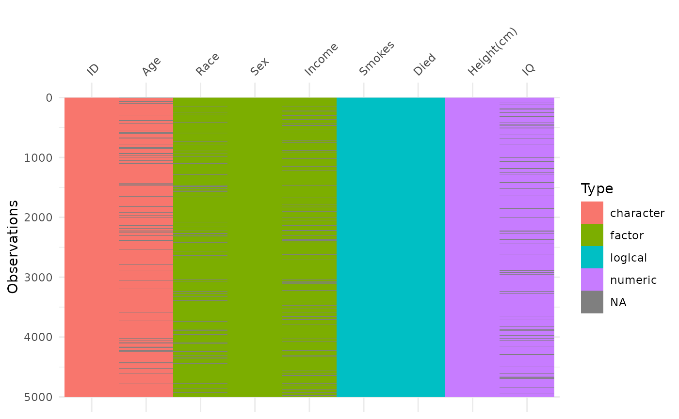
You can name the colours yourself like so (after first loading the
ggplot package.
library(ggplot2)
vis_dat(typical_data) +
  scale_fill_manual(
    values = c(
      "character" = "red",
      "factor" = "blue",
      "logical" = "green",
      "numeric" = "purple",
      "NA" = "gray"
  ))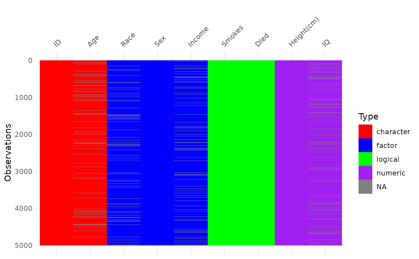
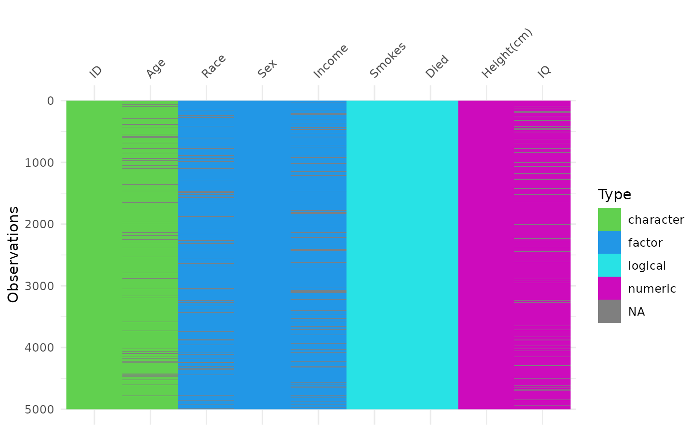
This is a pretty, uh, “popping” set of colours? You can also use some hex colours instead.
Say, taken from palette():
palette()
#> [1] "black"   "#DF536B" "#61D04F" "#2297E6" "#28E2E5" "#CD0BBC" "#F5C710"
#> [8] "gray62"
vis_dat(typical_data) +
  scale_fill_manual(
    values = c(
      "character" = "#61D04F",
      "factor" = "#2297E6",
      "logical" = "#28E2E5",
      "numeric" = "#CD0BBC",
      "NA" = "#F5C710"
  ))
How can we get nicer ones?
Well, you can use any of ggplot’s
scale_fill_* functions from inside ggplot2
For example:
vis_dat(typical_data) +
  scale_fill_brewer()
#> Warning: Removed 2000 rows containing missing values or values outside the scale range
#> (`geom_raster()`).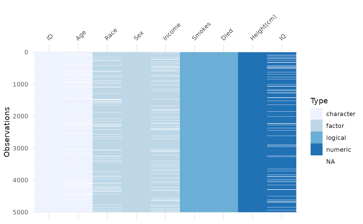
vis_dat(typical_data) +
  scale_fill_viridis_d()
#> Warning: Removed 2000 rows containing missing values or values outside the scale range
#> (`geom_raster()`).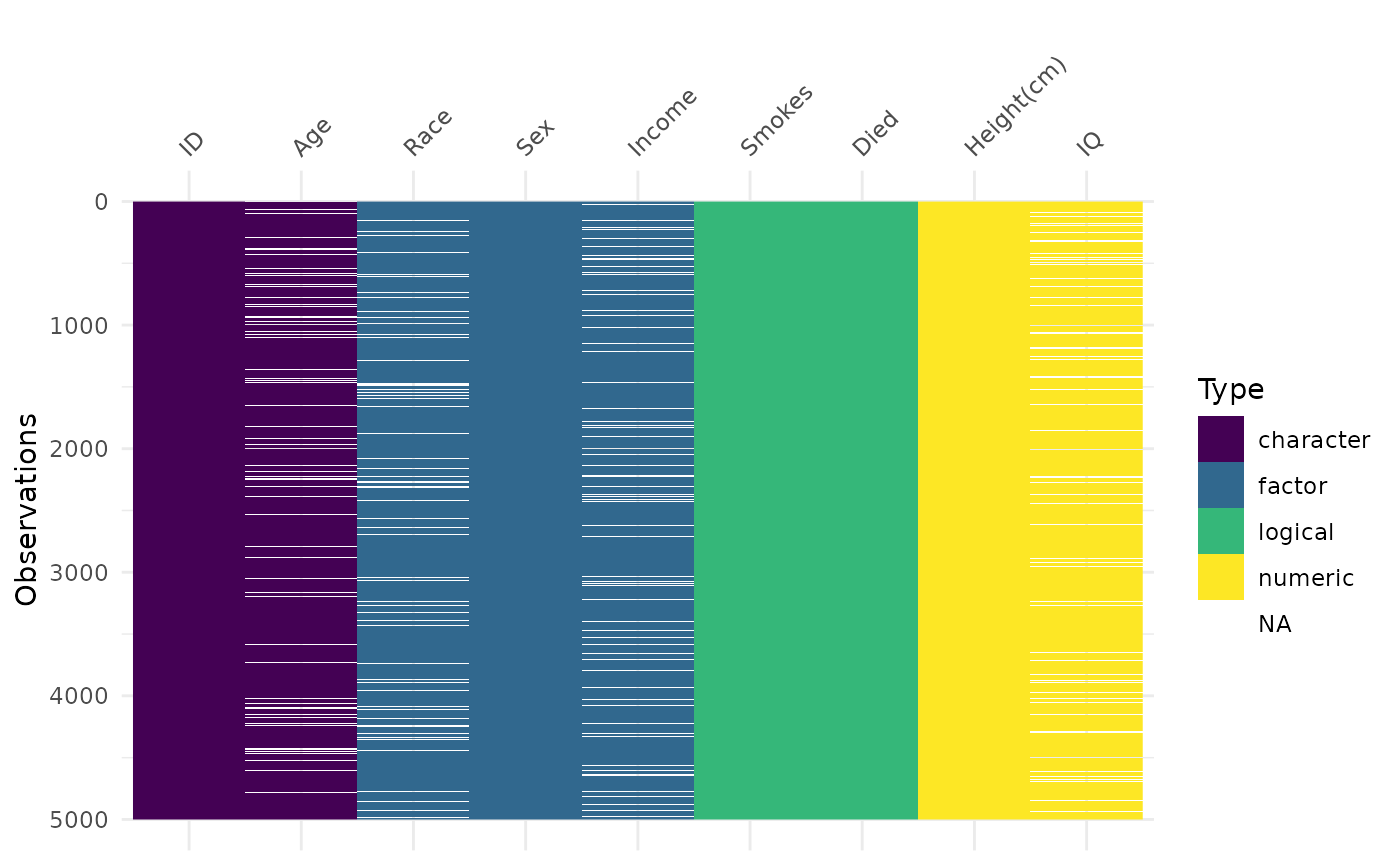
Happy colour palette exploring! You might want to take a look at some of the following colour palettes from other packages: