vis_dat gives you an at-a-glance ggplot object of what is inside a
dataframe. Cells are coloured according to what class they are and whether
the values are missing. As vis_dat returns a ggplot object, it is very
easy to customize and change labels, and customize the plot
Usage
vis_dat(
  x,
  sort_type = TRUE,
  palette = "default",
  warn_large_data = TRUE,
  large_data_size = 9e+05,
  facet
)
Arguments
- x
a data.frame object
- sort_type
logical TRUE/FALSE. When TRUE (default), it sorts by the type in the column to make it easier to see what is in the data
- palette
character "default", "qual" or "cb_safe". "default" (the default) provides the stock ggplot scale for separating the colours. "qual" uses an experimental qualitative colour scheme for providing distinct colours for each Type. "cb_safe" is a set of colours that are appropriate for those with colourblindness. "qual" and "cb_safe" are drawn from http://colorbrewer2.org/.
- warn_large_data
logical - warn if there is large data? Default is TRUE see note for more details
- large_data_size
integer default is 900000 (given by `nrow(data.frame) * ncol(data.frame)“). This can be changed. See note for more details.
- facet
bare variable name for a variable you would like to facet by. By default there is no facetting. Only one variable can be facetted. You can get the data structure using
data_vis_datand the facetted structure by usinggroup_byand thendata_vis_dat.
Value
ggplot2 object displaying the type of values in the data frame and
the position of any missing values.
Note
Some datasets might be too large to plot, sometimes creating a blank plot - if this happens, I would recommend downsampling the data, either looking at the first 1,000 rows or by taking a random sample. This means that you won't get the same "look" at the data, but it is better than a blank plot! See example code for suggestions on doing this.
Examples
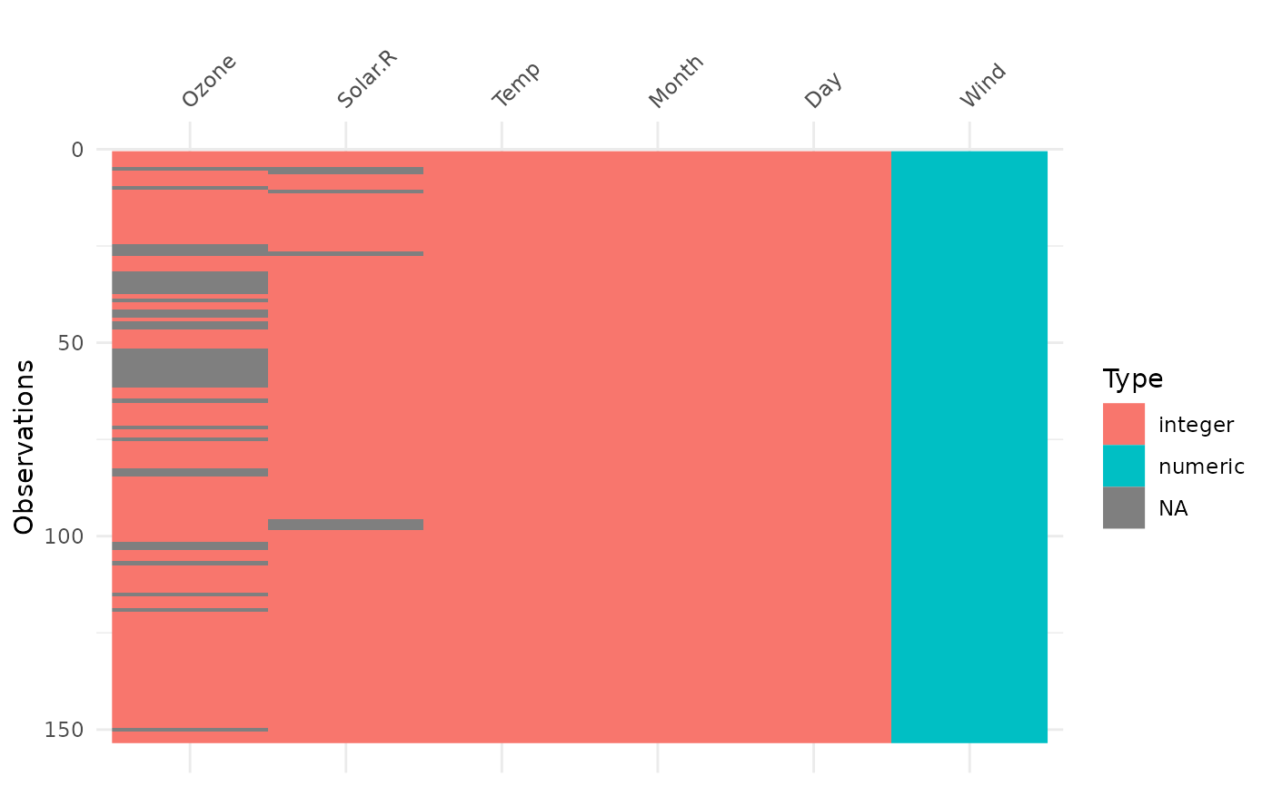
vis_dat(airquality)
 # experimental colourblind safe palette
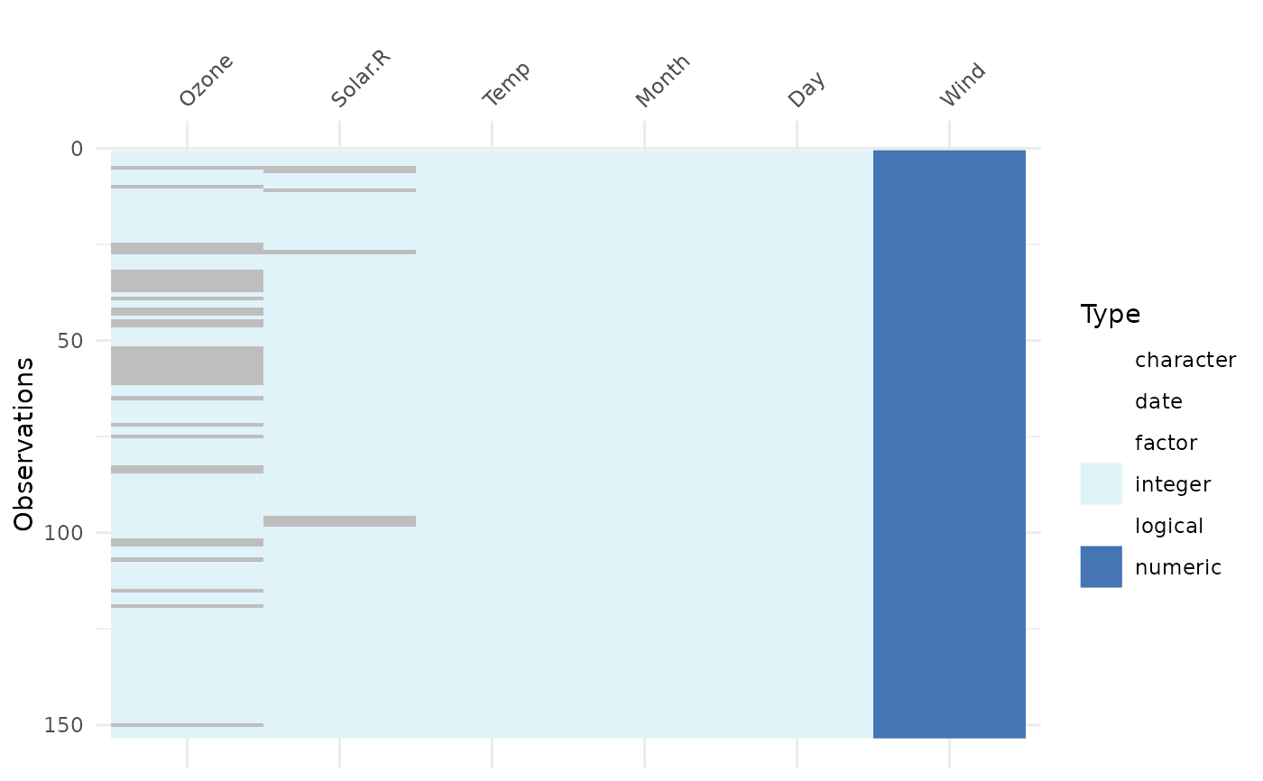
vis_dat(airquality, palette = "cb_safe")
# experimental colourblind safe palette
vis_dat(airquality, palette = "cb_safe")
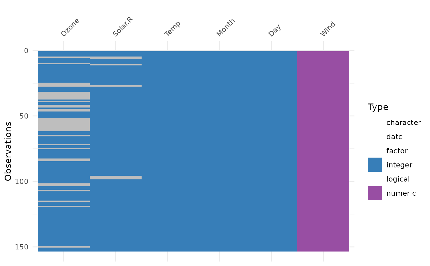
 vis_dat(airquality, palette = "qual")
 # if you have a large dataset, you might want to try downsampling:
if (FALSE) { # \dontrun{
library(nycflights13)
library(dplyr)
flights %>%
sample_n(1000) %>%
vis_dat()
flights %>%
slice(1:1000) %>%
vis_dat()
} # }
# if you have a large dataset, you might want to try downsampling:
if (FALSE) { # \dontrun{
library(nycflights13)
library(dplyr)
flights %>%
sample_n(1000) %>%
vis_dat()
flights %>%
slice(1:1000) %>%
vis_dat()
} # }