Simple plotting options for radiocarbon dates in c14_date_lists
Clemens Schmid
2026-07-01
Source:vignettes/simple_plotting.Rmd
simple_plotting.RmdThis vignette shows some basic workflows to plot radiocarbon dates in
c14_date_lists. This is only a short compilation to get you
started.
So let’s begin by loading the main packages for this endeavour:
c14bazAAR and ggplot2. And of
course magrittr to
enable the pipe (%>%) operator. We will use functions
from other packages as well, but address them individually with the
:: operator.
The basis for this example code is the adrac data collection by Dirk Seidensticker. So let’s download the data with the relevant c14bazAAR getter function:
adrac <- get_c14data("adrac")Temporal plotting of radiocarbon ages
Radiocarbon dating is a method to determine the absolute age of samples. Therefore one of the main aims for plotting naturally is to display temporal information. Let’s select the dates of one individual site – Batalimo in Central Africa – as a subset to reproduce two of the most common types of radiocarbon date plots.
If age modelling and date plotting on a local or regional scale is the major aim of your analysis, you might want to take a look at the oxcAAR package. It serves as an R interface to OxCal and provides powerful default plotting methods
Ridgeplots of density distributions
One way to plot radiocarbon ages is to show the probability density
distribution of individual calibrated dates as ridgeplots. To produce a
plot like that, we first of all need the age-probability information for
each date. We can calculate that with the function
c14bazAAR::calibrate().
This adds a list column calprobdistr to the input
c14_date_list. The list column contains a nested data.frame
for each date with its probability distribution.
##  Radiocarbon date list
##  dates: 7
##  sites: 1
##  countries: 1
##  uncalBP: 2000 - 200
##
## # A data frame: 7 × 18
##   sourcedb sourcedb_version sourcedb_version_number method labnr   c14age c14std
##   <chr>    <date>           <chr>                   <chr>  <chr>    <int>  <int>
## 1 adrac    2026-07-01       latest                  NA     Bdy-301   1890    130
## 2 adrac    2026-07-01       latest                  NA     Bdy-304   1730    120
## 3 adrac    2026-07-01       latest                  NA     Bdy-306   1990    210
## 4 adrac    2026-07-01       latest                  NA     Bdy-462    240     75
## 5 adrac    2026-07-01       latest                  NA     Bdy-465   1270    125
## 6 adrac    2026-07-01       latest                  NA     Bdy-581   1798    101
## 7 adrac    2026-07-01       latest                  NA     Gif-58…   1590     90
## # ℹ 11 more variables: calprobdistr <list>, c13val <dbl>, site <chr>,
## #   feature <chr>, period <chr>, material <chr>, country <chr>, lat <dbl>,
## #   lon <dbl>, shortref <chr>, comment <chr>
With tidyr::unnest() the list column can be dissolved
(“unnested”) and integrated into the initial c14_date_list.
Of course the latter looses its original structure and meaning with this
step. Each row now represents the probability for one date and year.
A table like that can be used for plotting a ridgeplot.
Batalimo_cal_dens %>%
  ggplot() +
  # a special geom for ridgeplots is provided by the ggridges package
  ggridges::geom_ridgeline(
    # the relevant variables that have to be mapped for this geom are
    # x (the time -- here the calibrated age transformed to calBC),
    # y (the individual lab number of the dates) and
    # height (the probability for each year and date)
    aes(x = -calage + 1950, y = labnr, height = density),
    # ridgeplots lack a scientifically clear y axis for each
    # distribution plot and we can adjust the scaling to our needs
    scale = 300
  ) +
  xlab("age calBC/calAD") +
  ylab("dates")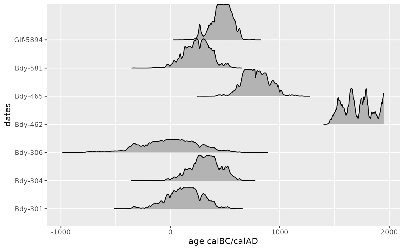
Calcurve plot
Another way to plot radiocarbon dates is to project them onto a
calibration curve. The Bchron R package
contains a data.frame with the intcal13
calibration curve data. We can load the intcal13 table
directly from Bchron.
load(system.file('data/intcal13.rda', package = 'Bchron'))For this kind of plot it is more convenient to work with the
simplified calrange output of
c14bazAAR::calibrate().
Like the calprobdistr option this also adds a list
column to the input c14_date_list, but a much smaller one.
For each date only the age ranges that make up the 2-sigma significance
interval of the probability distribution are stored.
Batalimo_calibrated$calrange[1:3]## [[1]]
## dens from to
## 1 91.9 1521 2148
## 2 3.3 2275 2287
##
## [[2]]
## dens from to
## 1 93.7 1363 1889
## 2 1.5 1913 1917
##
## [[3]]
## dens from to
## 1 94.1 1407 2430
## 2 1.2 2453 2460The resulting table can also be unnested to make the list column content available in the main table.
Now we can plot the calibration curve and – on top – error bars with
the calrange sequences.
ggplot() +
  # line plot of the intcal curve
  geom_line(
    data = intcal13,
    # again we transform the age information from BP to BC
    mapping = aes(x = -V1 + 1950, y = -V2 + 1950)
  ) +
  # the errorbars are plotted on top of the curve
  geom_errorbarh(
    data = Batalimo_cal_range,
    mapping = aes(y = -c14age + 1950, xmin = -to + 1950, xmax = -from + 1950)
  ) +
  # we define the age range manually -- typically the calcurve
  # is arranged to go from the top left to the bottom right corner
  xlim(-1000, 2000) +
  ylim(2000, -1000) +
  xlab("age calBC/calAD") +
  ylab("uncalibrated age BC/AD")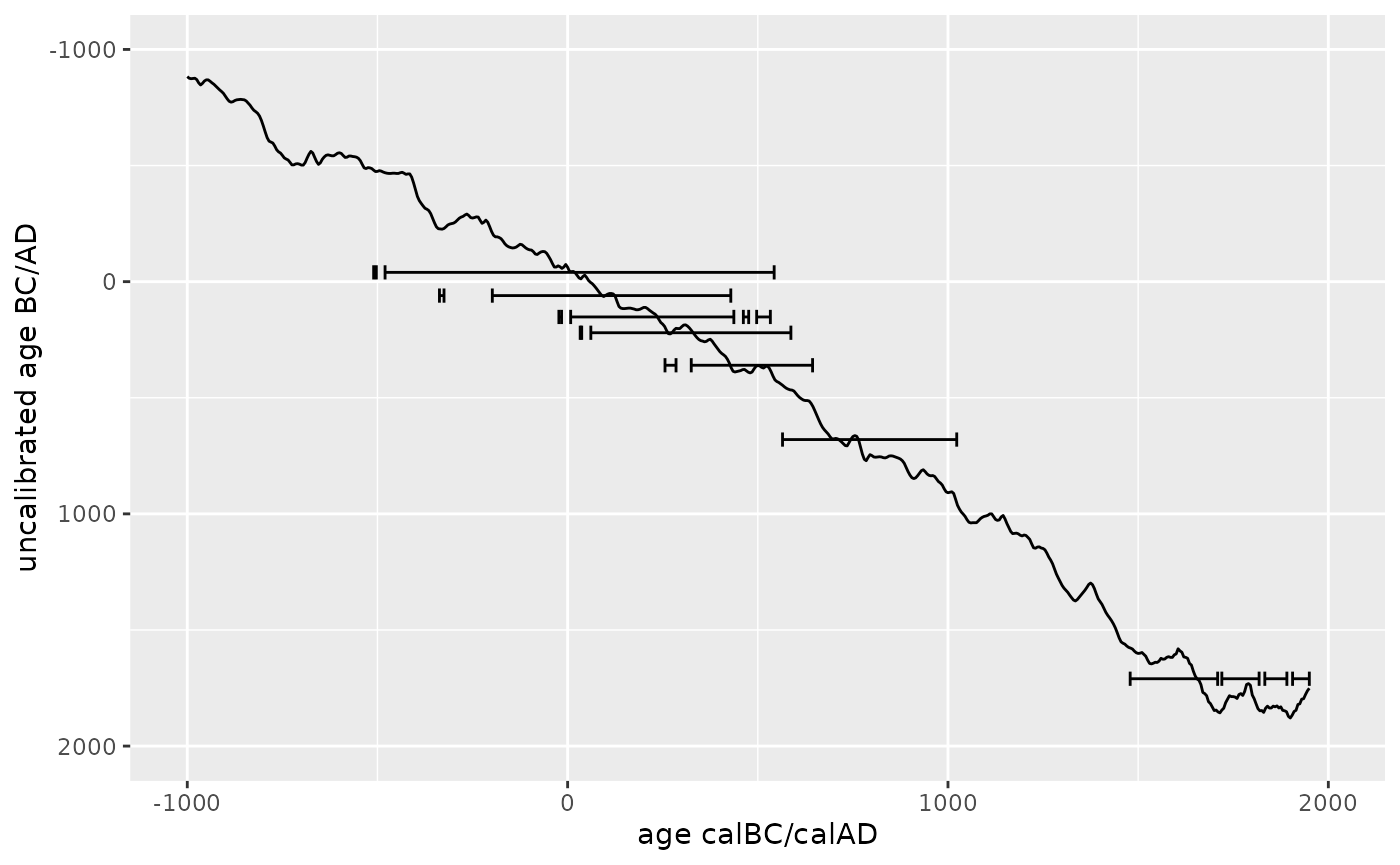
Spatial mapping of radiocarbon dates
Most radiocarbon dates that can be accessed with c14bazAAR have coordinate information for the respective sites where the samples were taken. Spatial maps therefore are an important form of data visualization as well.
c14_date_lists can directly be transformed to objects of
class sf. sf objects were introduced by the R
package sf which
provides a tidy interface to work with spatial data in R.
## Warning in remove_dates_without_coordinates(., quiet): Dates without
## coordinates were removed.
This tabular data structure contains the spatial point information for each date in a column geom, but also the initial columns of the input dataset: data.*
## Simple feature collection with 2303 features and 3 fields
## Geometry type: POINT
## Dimension:     XY
## Bounding box:  xmin: 8.717 ymin: -16.75 xmax: 30.683 ymax: 12.2
## Geodetic CRS:  WGS 84
##  Radiocarbon date list
##  dates: 2303
##  uncalBP: 46500 - 0
##
## # A data frame: 2,303 × 4
##    labnr    c14age c14std           geom
##    <chr>     <int>  <int>    <POINT [°]>
##  1 AA-33171  13800    100 (10.078 1.727)
##  2 AA-33172   6665     90 (10.078 1.727)
##  3 AA-33225  10015     55    (28.6 2.17)
##  4 AA-33226   6025     70    (28.6 2.17)
##  5 AA-36757   4254     49 (10.078 1.727)
##  6 AA-36758  10450     93 (10.078 1.727)
##  7 AA-36792   5810    290 (10.078 1.727)
##  8 AA-36793  30300   1300 (10.078 1.727)
##  9 AA-78447   2362     39 (16.924 3.989)
## 10 AA-78448   2171     37 (16.924 3.989)
## # ℹ 2,293 more rows
It can be manipulated with the powerful dplyr functions. We
filter out all dates from one particular publication
(Moga 2008), group the dates by
site and apply the summarise command to keep only
one value per group. As we do not define an operation to fold the other
variables in the input table, they are removed. Only the geometry column
remains.
Moga_spatial <- adrac_sf %>%
  dplyr::filter(grepl("Moga 2008", shortref)) %>%
  dplyr::group_by(site) %>%
  dplyr::summarise(.groups = "drop")
Interactive map view
The resulting sf object can be plotted interactively
with the mapview
package.
# Moga_spatial %>% mapview::mapview()Static map plot
The sf object can also be used for a static plot – which
is useful for publications. We download some simple country border base
map vector data with the rnaturalearth
R package and transform it to sf as well.
countries <- rnaturalearth::ne_countries() %>% sf::st_as_sf()Now we can combine the base layer and our point data to create the prototype of a static map plot.
ggplot() +
  # geom_sf is a special geom to handle spatial data in the sf format
  geom_sf(data = countries) +
  # the explicit mapping of variables is not necessary here, as geom_sf
  # automatically finds the *geom* column in the input table
  geom_sf_text(data = countries, mapping = aes(label = formal_en), size = 2) +
  geom_sf(data = Moga_spatial) +
  # with geom_sf comes coord_sf to manage the underlying coordinate grid
  coord_sf(xlim = c(10, 30), ylim = c(0, 15))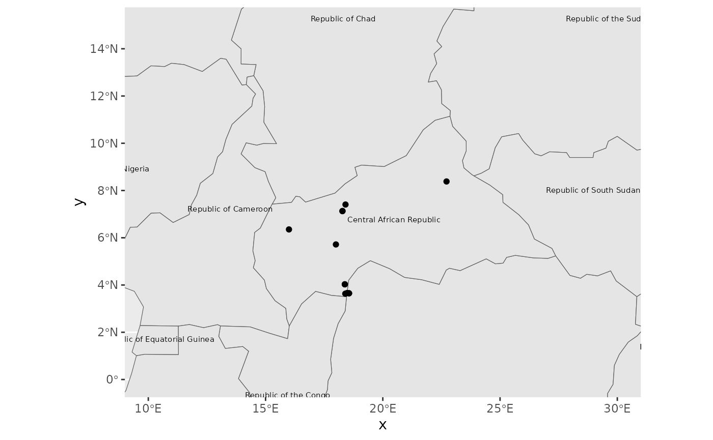
Please feel free to open an issue here if you have questions about plotting radiocarbon dates.