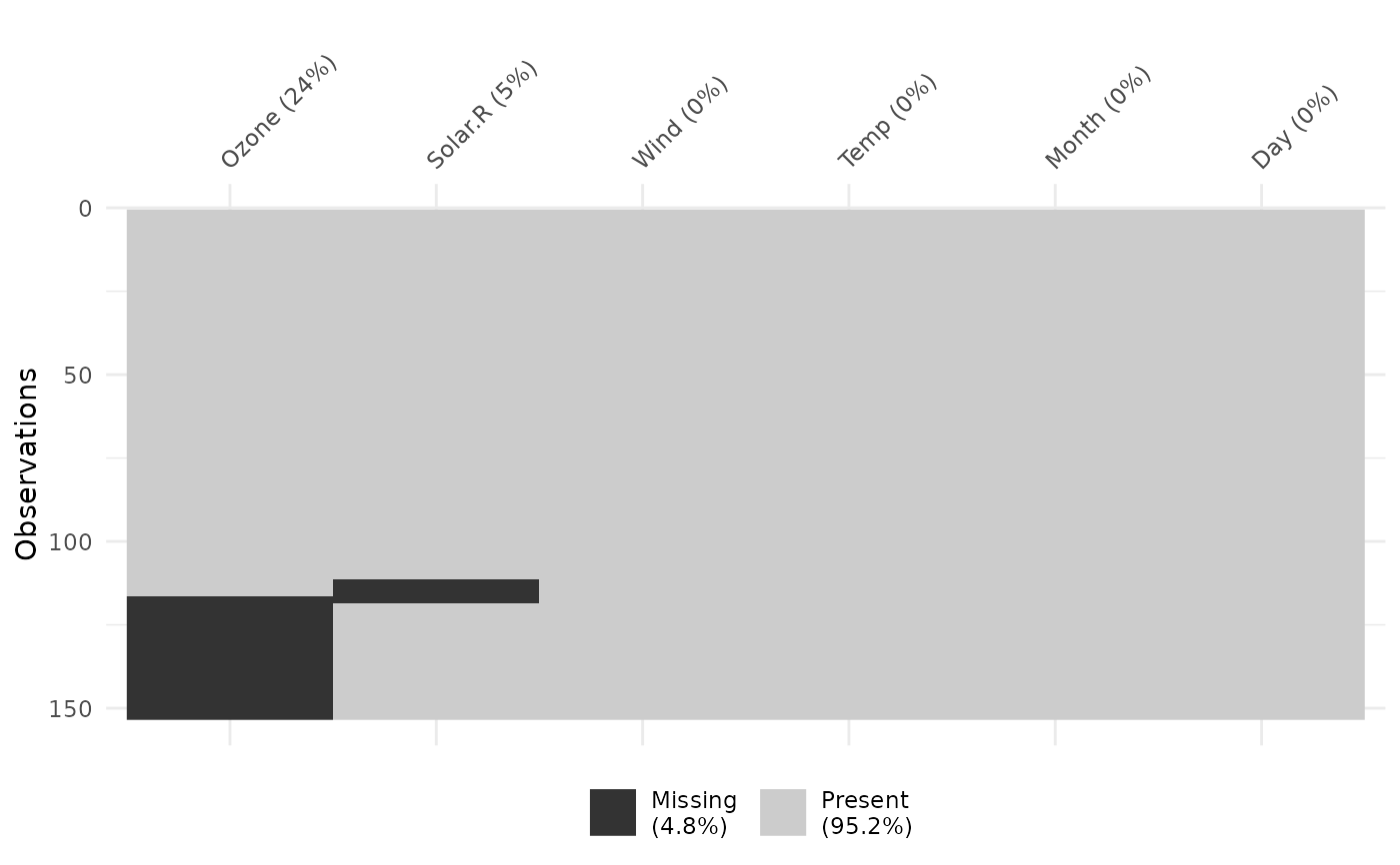
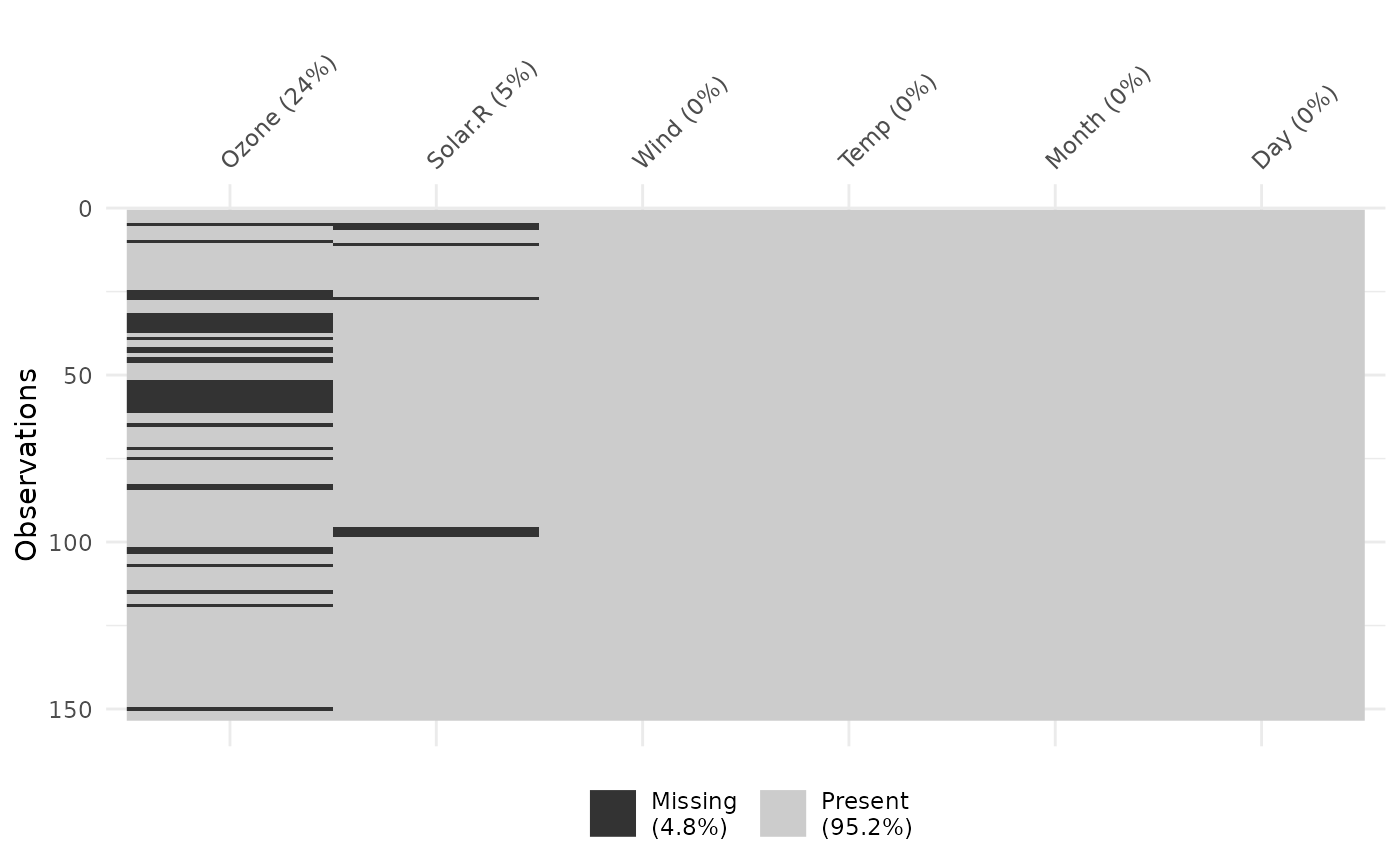
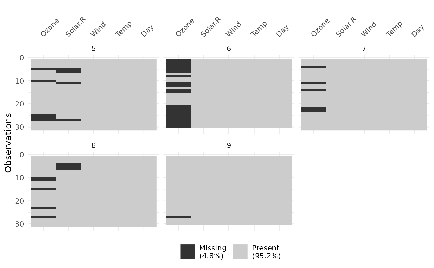
vis_miss provides an at-a-glance ggplot of the missingness inside a
dataframe, colouring cells according to missingness, where black indicates
a missing cell and grey indicates a present cell. As it returns a ggplot
object, it is very easy to customize and change labels.
Usage
vis_miss(
  x,
  cluster = FALSE,
  sort_miss = FALSE,
  show_perc = TRUE,
  show_perc_col = TRUE,
  large_data_size = 9e+05,
  warn_large_data = TRUE,
  facet
)
Arguments
- x
a data.frame
- cluster
logical. TRUE specifies that you want to use hierarchical clustering (mcquitty method) to arrange rows according to missingness. FALSE specifies that you want to leave it as is. Default value is FALSE.
- sort_miss
logical. TRUE arranges the columns in order of missingness. Default value is FALSE.
- show_perc
logical. TRUE now adds in the \ in the whole dataset into the legend. Default value is TRUE.
- show_perc_col
logical. TRUE adds in the \ column into the x axis. Can be disabled with FALSE. Default value is TRUE. No missingness percentage column information will be presented when
facetargument is used. Please see thenaniarpackage to provide missingness summaries over groups.- large_data_size
integer default is 900000 (given by `nrow(data.frame) * ncol(data.frame)“). This can be changed. See note for more details.
- warn_large_data
logical - warn if there is large data? Default is TRUE see note for more details
- facet
(optional) bare variable name, if you want to create a faceted plot, with one plot per level of the variable. No missingness percentage column information will be presented when
facetargument is used. Please see thenaniarpackage to provide missingness summaries over groups.
Value
ggplot2 object displaying the position of missing values in the
dataframe, and the percentage of values missing and present.
Details
The missingness summaries in the columns are rounded to the nearest integer.
For more detailed summaries, please see the summaries in the naniar R
package, specifically, naniar::miss_var_summary().
Note
Some datasets might be too large to plot, sometimes creating a blank plot - if this happens, I would recommend downsampling the data, either looking at the first 1,000 rows or by taking a random sample. This means that you won't get the same "look" at the data, but it is better than a blank plot! See example code for suggestions on doing this.
Examples
vis_miss(airquality)


vis_miss(airquality, cluster = TRUE)


vis_miss(airquality, sort_miss = TRUE)


vis_miss(airquality, facet = Month)


if (FALSE) { # \dontrun{
# if you have a large dataset, you might want to try downsampling:
library(nycflights13)
library(dplyr)
flights %>%
  sample_n(1000) %>%
  vis_miss()

flights %>%
  slice(1:1000) %>%
  vis_miss()
} # }
if (FALSE) { # \dontrun{
# if you have a large dataset, you might want to try downsampling:
library(nycflights13)
library(dplyr)
flights %>%
sample_n(1000) %>%
vis_miss()
flights %>%
slice(1:1000) %>%
vis_miss()
} # }