Interfacing a variety of different NetLogo models
Marco Sciaini
2026-07-01
Source:vignettes/articles/interfacing-different-models.Rmd
interfacing-different-models.RmdHere, we present examples on how to interface a variety of different NetLogo models. NetLogo model interfaces are very diverse across models and might contain spatial elements of different types (patches, different groups of turtles, links). With our interfacing examples, we try to cover a wide range of different models to show how nlrx can be utilized for various applications.
Our examples show how spatial output from NetLogo models can be used to create animated gif files, displaying patches and turtles properties over time. We explicitly show how to setup, postprocess and plot spatial output for very different model types. Although, the following examples cover a wide range of output types, it is likely that different experiment measurements or postprocessing needs to be done for specific and complex models. If you have problems to interface a specific type of model, feel free to send one of the authors of nlrx an email!
First, we need to load a bunch of packages, mainly for the subsetting of the spatial data and the plotting:
## Load packages
library(nlrx)
library(tidyverse)
library(ggplot2)
library(gganimate)
library(cartography)
library(rcartocolor)
library(ggthemes)
Second, we need to define the path variables pointing to the NetLogo installation. Depending on the operation system, the NetLogo and output paths need to be adjusted.
# Windows default NetLogo installation path (adjust to your needs!):
netlogopath <- file.path("C:/Program Files/NetLogo 6.0.4")
outpath <- file.path("C:/out")
# Unix default NetLogo installation path (adjust to your needs!):
netlogopath <- file.path("/home/NetLogo 6.0.4")
outpath <- file.path("/home/out")
… and now are ready to interface some of the models of the NetLogo model library.
Diffusion model
The diffusion model is a simple example of how to plot moving turtles and patches. Turtles move over the lattice and generate heat on cells they move over. The accumulated heat also diffuses to neighboring cells.
In order to transfer the spatial information from NetLogo to R, we measure the who number and coordinates of all turtles (metrics.turtles) and coordinates, patch color and amount of heat of all patches (metrics.patches).
After converting the spatial data to tibble format
(unnest_simoutput()), we split the spatial data into a
turtles tibble and a patches tibble using the agent column of the
returned tibble from unnest_simoutput(). The plot consist
of a geom_tile layer, which displays the amount of heat in each cell and
a geom_point layer that displays the movement of the turtles. In order
to render animated gifs with gganimate it is very important to set the
group property of the turtles layer correctly (group=who).
## Step1: Create a nl obejct:
nl <- nl(nlversion = "6.0.4",
         nlpath = netlogopath,
         modelpath = file.path(netlogopath, "app/models/Sample Models/Art/Diffusion Graphics.nlogo"),
         jvmmem = 1024)

## Step2: Add Experiment
nl@experiment <- experiment(expname = "diffusion",
                            outpath = outpath,
                            repetition = 1,
                            tickmetrics = "true",
                            idsetup = "setup",
                            idgo = "go",
                            runtime = 500,
                            evalticks = seq(1,500),
                            constants = list("num-turtles" = 20,
                                             "diffusion-rate" = 1,
                                             "turtle-heat" = 139,
                                             "turtle-speed" = 1.0,
                                             "wander?" = "TRUE"),
                            metrics.turtles = list("turtles" = c("who", "xcor", "ycor")),
                            metrics.patches = c("pxcor", "pycor", "pcolor", "heat"))

# Evaluate if variables and constants are valid:
eval_variables_constants(nl)

## Step3: Add a Simulation Design
nl@simdesign <- simdesign_simple(nl = nl,
                                 nseeds = 1)


# Step4: Run simulations:
results <- run_nl_all(nl = nl)

## Postprocessing:
## Step1: Attach results to nl:
setsim(nl, "simoutput") <- results


# Prepare data for plotting
nl_spatial <- unnest_simoutput(nl)
n <- nl@experiment@runtime

turtles <- nl_spatial %>% dplyr::filter(agent == "turtles" & `[step]` < n) %>% dplyr::select(xcor, ycor, `[step]`, who)
patches <- nl_spatial %>% dplyr::filter(agent == "patches"& `[step]` < n) %>% dplyr::select(pxcor, pycor, pcolor, `[step]`)

## Plot animation:
p1 <- ggplot() +
  geom_tile(data = patches, aes(x=pxcor, y = pycor, fill=pcolor)) +
  geom_point(data = turtles, aes(x = xcor, y = ycor, group = who), size=2) +
  scale_fill_carto_c(palette = "Prism") +
  transition_time(`[step]`) +
  guides(fill="none", color="none") +
  coord_equal() +
  theme_void()

gganimate::animate(p1, nframes = n, width=800, height=800, duration=6)
Fire model
Similar to the diffusion example, the fire model displays patches and moving turtles. However, the model contains two turtle breeds which need to be displayed differently.
Thus, we also measure the turtle breed (metrics.turtles). Before plotting we split up the turtle data into two tibbles, one for each breed. This allows us to create two different geom_point layers with different aesthetics.
## Step1: Create a nl obejct:
nl <- nl(nlversion = "6.0.4",
         nlpath = netlogopath,
         modelpath = file.path(netlogopath, "app/models/Sample Models/Earth Science/Fire.nlogo"),
         jvmmem = 1024)

## Step2: Add Experiment
nl@experiment <- experiment(expname = "fire",
                            outpath = outpath,
                            repetition = 1,
                            tickmetrics = "true",
                            idsetup = "setup",
                            idgo = "go",
                            runtime = 500,
                            evalticks = seq(1,500),
                            metrics = c("count patches"),
                            metrics.turtles = list("turtles" = c("who", "pxcor", "pycor", "breed", "color")),
                            metrics.patches = c("pxcor", "pycor", "pcolor"),
                            constants = list('density' = 62)
)

# Evaluate if variables and constants are valid:
eval_variables_constants(nl)

## Step3: Add a Simulation Design
nl@simdesign <- simdesign_simple(nl = nl,
                                 nseeds = 1)


# Step4: Run simulations:
results <- run_nl_all(nl = nl)

## Postprocessing:
## Step1: Attach results to nl:
setsim(nl, "simoutput") <- results

nl_spatial <- unnest_simoutput(nl)
n <- max(nl_spatial$`[step]`)

embers <- nl_spatial %>% dplyr::filter(breed == "embers" & agent == "turtles" & `[step]` < n) %>% dplyr::select(pxcor, pycor, `[step]`, color, who)
fires <- nl_spatial %>% dplyr::filter(breed == "fires" & agent == "turtles" & `[step]` < n) %>% dplyr::select(pxcor, pycor, `[step]`, color, who)
patches <- nl_spatial %>% dplyr::filter(agent == "patches" & `[step]` < n) %>% dplyr::select(pxcor, pycor, pcolor, `[step]`)

# make same space in the memory
rm(nl)
rm(results)
rm(nl_spatial)
gc()

#----------------------------------
## Plot animation:
p1 <- ggplot(embers) +
  geom_tile(data = patches, aes(x=pxcor, y=pycor, fill=factor(pcolor))) +
  geom_point(data = embers, aes(x = pxcor, y = pycor, color = color, group = who), size=2) +
  scale_color_gradientn(colors = rev(cartography::carto.pal("orange.pal", n1 = 8))) +
  geom_point(data = fires, aes(x = pxcor, y = pycor, color = color, group = who), size=3) +
  scale_fill_manual(values = c("0" = "gray24", "55" = "#83B37D", "11.4" = "#B59A89")) +
  transition_time(`[step]`) +
  guides(fill="none", color="none") +
  coord_equal() +
  theme_void()

g1 <- gganimate::animate(p1, nframes = n, width=800, height=800, duration = 6)
Ants model
The Ants model is another typical example for displaying patches and moving turtles. Ants move across the lattice in order to gather food from food sources and returning food to their nest in the center. Ants carrying food leave a trail of chemicals on cells they move over. These chemicals also diffuse to neighboring cells over time. Displaying the patches output from the model is not straightforward because three different groups of patches exist: food sources, ants nest and all other patches which are colored depending on the amount of chemicals that the patch contains.
In order to transfer the spatial information from NetLogo to R, we measure the who number, coordinates and breed for all turtles (metrics.turtles) and coordinates, patch color, amount of chemicals, presence of food and the food source number of all patches (metrics.patches).
After converting the spatial data to tibble format
(unnest_simoutput()), we split the patches information in
three objects in order to display the three groups of patches:
- chem_dat: Contains chemical distribution of all patches. The amount of chemicals of each patch is plotted by using a geom_tile layer that acts as base layer of our plot.
- food_dat: Contains patches coordinates of patches that contain food sources (food > 0). The food sources are plotted by adding a square shaped geom_point layer on top of the chemicals distribution layer.
- nest_dat: Contains patches coordinates of the nest patch. The nest is plotted by adding a large circle geom_point layer on top.
The turtle data is plotted by adding another geom_text layer, using a Yen sign (¥) that displays the movement of the turtles. In order to render animated gifs with gganimate it is very important to set the group property of the layer correctly (group=who).
The plot need to be stored in an object before it can be rendered
with the gganimate function. In some cases, it is important
to set the number of frames explicitly to the number of steps of your
simulation output. Otherwise, gganimate may interpolate between measured
steps, which may lead to incorrect results.
## Step1: Create a nl obejct:
nl <- nl(nlversion = "6.0.4",
         nlpath = netlogopath,
         modelpath = file.path(netlogopath, "app/models/Sample Models/Biology/Ants.nlogo"),
         jvmmem = 1024)

## Step2: Add Experiment
nl@experiment <- experiment(expname = "ants",
                            outpath = outpath,
                            repetition = 1,
                            tickmetrics = "true",
                            idsetup = "setup",
                            idgo = "go",
                            runtime = 1000,
                            evalticks = seq(1,1000),
                            metrics.turtles = list("turtles" = c("who", "pxcor", "pycor", "breed")),
                            metrics.patches = c("pxcor", "pycor", "pcolor", "chemical", "food", "food-source-number"),
                            constants = list("population" = 125,
                                             'diffusion-rate' = 50,
                                             'evaporation-rate' = 10))

## Step3: Add a Simulation Design
nl@simdesign <- simdesign_simple(nl = nl,
                                 nseeds = 1)


## Step4: Run simulations:
results <- run_nl_all(nl = nl)

## Step5: Attach results to nl and reformat spatial data with get_nl_spatial()
setsim(nl, "simoutput") <- results
nl_spatial <- unnest_simoutput(nl)

## Step6: Prepare data for plotting
# Extract infromation on food sources and select maximum step as simulation length:
food_dat <- nl_spatial %>% dplyr::filter(food > 0) %>% dplyr::select(pxcor, pycor, `[step]`)
nmax <- max(food_dat$`[step]`)
food_dat <- food_dat %>% dplyr::filter(`[step]` %in% 1:nmax)
# Extract information on chemicals and apply minimum treshhold for coloring:
chem_dat <- nl_spatial %>% dplyr::filter(`[step]` %in% 1:nmax) %>% dplyr::select(pxcor, pycor, chemical, `[step]`)
chem_dat$chemical <- ifelse(chem_dat$chemical <= 0.2, NA, chem_dat$chemical)
# Extract information on turtle positions:
turt_dat <- nl_spatial %>% dplyr::filter(!is.na(who)) %>% dplyr::filter(`[step]` %in% 1:nmax) %>% dplyr::select(pxcor, pycor, who, `[step]`)
# Create a new data frame to overlay the nest position (in this case the center of the world 0,0)
nest_dat <- food_dat
nest_dat$pxcor <- 0
nest_dat$pycor <- 0

## Step7: Plotting
p1 <- ggplot(food_dat) +
  geom_tile(data=chem_dat, aes(x=pxcor, y=pycor, fill=sqrt(chemical))) +
  geom_point(data=food_dat, aes(x=pxcor, y=pycor), color="black", shape=15, size=4.5, alpha=1) +
  geom_text(data=turt_dat, aes(x=pxcor, y=pycor, group=who, color=as.numeric(who)), size=5, alpha=1, label="¥") +
  geom_point(data=nest_dat, aes(x=pxcor, y=pycor), color="brown", fill="white", size=30, stroke=2, shape=21) +
  scale_fill_viridis_c(direction=-1, option="magma", na.value = "white") +
  scale_color_gradient_tableau(palette="Orange") +
  transition_time(`[step]`) +
  guides(fill="none", color="none") +
  coord_equal() +
  labs(title = 'Step: {frame_time}') +
  theme_void()

## Step8: Animate the plot and use 1 frame for each step of the model simulations
gganimate::animate(p1, nframes = nmax, width=800, height=800, fps=10)
Waves model
The waves model contains no patch information. Three types of turtle agents are present in the model: waves, edges and a driver. However, these agents are not defined by using breeds but by using turtles-own variables (driver?, edge?).
In addition to these two variables we measure the who number, turtle
coordinates and turtle color. Again, before plotting we split the
spatial data tibble from unnest_simoutput() into three
different tibbles, one for each agent group. These agent groups are then
plotted by using geom_point layers with different aesthetics.
Instead of a simple simdesign with only one parameterization, this example uses a distinct simdesign with 4 different friction values. We can use the facet functionality of ggplot to visualize all four model runs at once.
## The models library filepath pointing to the waves model contains an ampersand which needs to be escaped on Windows but not on Linux.
## Choose the filepath according to your OS:
## Windows:
modelpath <- "app/models/Sample Models/Chemistry ^& Physics/Waves/Wave Machine.nlogo"
## Linux:
modelpath <- "app/models/Sample Models/Chemistry & Physics/Waves/Wave Machine.nlogo"

## Step1: Create a nl obejct:
nl <- nl(nlversion = "6.0.4",
         nlpath = netlogopath,
         modelpath = file.path(netlogopath, modelpath),
         jvmmem = 1024)

## Step2: Add Experiment
nl@experiment <- experiment(expname = "waves",
                            outpath = outpath,
                            repetition = 1,
                            tickmetrics = "true",
                            idsetup = "setup",
                            idgo = "go",
                            runtime = 100,
                            evalticks = seq(1,100),
                            variables = list('friction' = list(values = c(5,25,50,90))),
                            constants = list("stiffness" = 20),
                            metrics.turtles = list("turtles" = c("who", "xcor", "ycor", "driver?", "edge?", "color")))

## Step3: Add a Simulation Design
nl@simdesign <- simdesign_distinct(nl = nl,
                                   nseeds = 1)


# Step4: Run simulations:
results <- run_nl_all(nl = nl)

## Postprocessing:
## Step1: Attach results to nl:
setsim(nl, "simoutput") <- results


# Prepare data for plotting
nl_spatial <- unnest_simoutput(nl)

nl_spatial$friction <- factor(nl_spatial$friction)
levels(nl_spatial$friction) <- c("Friction = 5",
                                 "Friction = 25",
                                 "Friction = 50",
                                 "Friction = 90")

n <- nl@experiment@runtime

waves  <- nl_spatial %>% dplyr::filter(`driver?` == "false" & `edge?` == "false" & `[step]` < n) %>% dplyr::select(xcor, ycor, `[step]`, who, color, friction)
egde   <- nl_spatial %>% dplyr::filter(`driver?` == "false" & `edge?` == "true" & `[step]` < n) %>% dplyr::select(xcor, ycor, `[step]`, who, friction)
driver <- nl_spatial %>% dplyr::filter(`driver?` == "true" & `edge?` == "false" & `[step]` < n) %>% dplyr::select(xcor, ycor, `[step]`, who, friction)

p1 <- ggplot(waves) +
  geom_point(data = waves, aes(x = xcor, y = ycor, group = who, color = color), size=2) +
  geom_point(data = driver, aes(x = xcor, y = ycor, group = who), size=2, color = "grey") +
  geom_point(data = egde, aes(x = xcor, y = ycor, group = who), size=2, color = "black") +
  facet_wrap(~friction) +
  transition_time(`[step]`) +
  guides(color="none") +
  coord_equal() +
  theme_void()

gganimate::animate(p1, width=800, height=800, duration = 6)
Flocking Model
The flocking model describes bird flocking formation using very simplified movement rules. For this model, headings (=viewing angles) of agents are crucial. The NetLogo heading system is measured in degree, ranging from 0 to 359. An agent with heading = 0 is pointing straight to the top border of the lattice. In order to transfer the NetLogo heading system to the ggplot and gganimate angle system, some conversions need to be done. The type of conversion depends on the geom that is used for plotting. We present two examples for heading conversion:
geom_text can be used to plot arrows pointing into the heading of the agent. geom_text also uses degree angles, however an angle of 0 means text is pointing to the right edge of the plotting area. Furthermore, angles are counter-clockwise, whereas NetLogo headings are defined in clockwise direction. In our case we use a right-pointing ASCII-arrow as geom_text label. Thus, we need to shift all NetLogo headings by 90 degree to the right and invert the direction by multiplying all headings with -1.
geom_spoke can be used to plot arrows pointing into the heading of the agent. geom_spoke uses radians angles. Similar to geom_text angles, an angle of 0 is pointing to the right and angles are defined in counter-clockwise direction. Thus, we need to shift NetLogo headings by 90 degree to the right, inverse the direction by multiplying all headings with -1 and finally transform the degree angles to radians angles.
## Step1: Create a nl obejct:
nl <- nl(nlversion = "6.0.4",
         nlpath = netlogopath,
         modelpath = file.path(netlogopath, "app/models/Sample Models/Biology/Flocking.nlogo"),
         jvmmem = 1024)

## Step2: Add Experiment
nl@experiment <- experiment(expname = "flocking",
                            outpath = outpath,
                            repetition = 1,
                            tickmetrics = "true",
                            idsetup = "setup",
                            idgo = "go",
                            runtime = 300,
                            evalticks = seq(1,300),
                            constants = list("population" = 100,
                                             "vision" = 5,
                                             "minimum-separation" = 1,
                                             "max-align-turn" = 4,
                                             "max-cohere-turn" = 4,
                                             "max-separate-turn" = 4),
                            metrics.turtles = list("turtles" = c("who", "xcor", "ycor", "heading", "color")))

# Evaluate if variables and constants are valid:
eval_variables_constants(nl)

## Step3: Add a Simulation Design
nl@simdesign <- simdesign_simple(nl = nl,
                                 nseeds = 1)


# Step4: Run simulations:
results <- run_nl_all(nl = nl)

setsim(nl, "simoutput") <- results

nl_spatial <- unnest_simoutput(nl)

## Calculate angles for plotting:
# (a) convert NetLogo degree headings (clockwise with 0 = top) to geom_text degree angle (counter-clockwise with 0 = right)
# (b) convert geom_text degree angle to geom_spoke radians angle
nl_spatial <- nl_spatial %>%
  dplyr::select(`[step]`, who, xcor, ycor, heading, color) %>%
  mutate(heading_text = ((heading * -1) + 90)) %>%
  mutate(heading_radians = ((heading_text * pi) / 180))

# Plot with geom_point and geom_spoke
p1 <- ggplot(nl_spatial, aes(x=xcor, y=ycor)) +
  geom_point(aes(color=color, group=who)) +
  geom_spoke(aes(color=color, group=who, angle=heading_radians), arrow=arrow(length=unit(0.2, "inches")), radius=1) +
  scale_color_viridis_c() +
  guides(color=FALSE) +
  transition_time(`[step]`) +
  coord_equal() +
  theme_void()

gganimate::animate(p1, nframes=max(nl_spatial$`[step]`), width=600, height=600, fps=20)
# Plot with geom_text
p2 <- ggplot(nl_spatial, aes(x=xcor, y=ycor)) +
  geom_text(aes(color=color, group=who, angle=heading_text), label="→", size=5) +
  scale_color_viridis_c() +
  guides(color=FALSE) +
  transition_time(`[step]`) +
  coord_equal() +
  theme_void()

gganimate::animate(p2, nframes=max(nl_spatial$`[step]`), width=600, height=600, fps=20)
Preferential Attachment
The preferential attachment model from the NetLogo models library is a simple model of a growing network. New nodes spawn each time step and connect to the already existing network. The network is realized by connecting turtles with links. This example shows how link metrics can be measured, using the metrics.links slot of the experiment. Link positions in NetLogo are defined by start and end points (end1, end2) using who numbers of the turtles they connect. Thus, on each tick we measure end1 and end2 of each link (metrics.links) and the who number, xcor, ycor and color of each node turtle (metrics.turtles).
Visualize network using ggplot
Again, after attaching the simulation results and postprocessing with
unnest_simoutput() we split the tibble into a turtles
tibble and a links tibble by subsetting the group column.
Finally, we need to reference the who number start and end points of the links to the actual coordinates of the corresponding turtle on each step. This can be easily achieved with two left_join calls, one for end1 who numbers and one for end2 who numbers.
## Step1: Create a nl obejct:
nl <- nl(nlversion = "6.0.4",
         nlpath = netlogopath,
         modelpath = file.path(netlogopath, "app/models/Sample Models/Networks/Preferential Attachment.nlogo"),
         jvmmem = 1024)

## Step2: Add Experiment
nl@experiment <- experiment(expname = "networks",
                            outpath = outpath,
                            repetition = 1,
                            tickmetrics = "true",
                            idsetup = "setup",
                            idgo = "go",
                            runtime = 200,
                            evalticks = seq(1,200),
                            constants = list("layout?" = TRUE),
                            metrics.turtles = list("turtles" = c("who",
                                                                 "xcor",
                                                                 "ycor",
                                                                 "color")),
                            metrics.links = list("links" = c("[who] of end1","[who] of end2")))

## Step3: Add simdesign
nl@simdesign <- simdesign_simple(nl=nl, nseeds = 1)

## Run simulation:
results <- run_nl_one(nl = nl,
                      seed = getsim(nl, "simseeds")[1],
                      siminputrow = 1)

## Attach results to nl
setsim(nl, "simoutput") <- results

## Postprocess spatial metrics with get_nl_spatial:
nl_spatial <- unnest_simoutput(nl)

## Subset nl_spatial using the group column:
nl_links <- nl_spatial %>%
  dplyr::filter(agent == "links") %>%
  dplyr::select(-who, -xcor, -ycor, -color)

nl_turtles <- nl_spatial %>%
  dplyr::filter(agent == "turtles") %>%
  dplyr::select(`[step]`, who, xcor, ycor, color)

## Reference who numbers of link start (end1) and end (end2) points to actual coordinates:
nl_links <- nl_links %>%
  dplyr::left_join(nl_turtles, by=c("[step]"="[step]","end1" = "who")) %>%
  dplyr::left_join(nl_turtles, by=c("[step]"="[step]","end2" = "who"))

## Plot:
p1 <- ggplot() +
  geom_point(data=nl_turtles, aes(x = xcor, y = ycor, group=who), color="red", size=2) +
  geom_segment(data=nl_links, aes(x = xcor.x, y = ycor.x, xend = xcor.y, yend = ycor.y), size=0.5) +
  transition_time(`[step]`) +
  coord_equal() +
  theme_void()

gganimate::animate(p1, nframes = max(nl_turtles$`[step]`), width=400, height=400, fps=8)
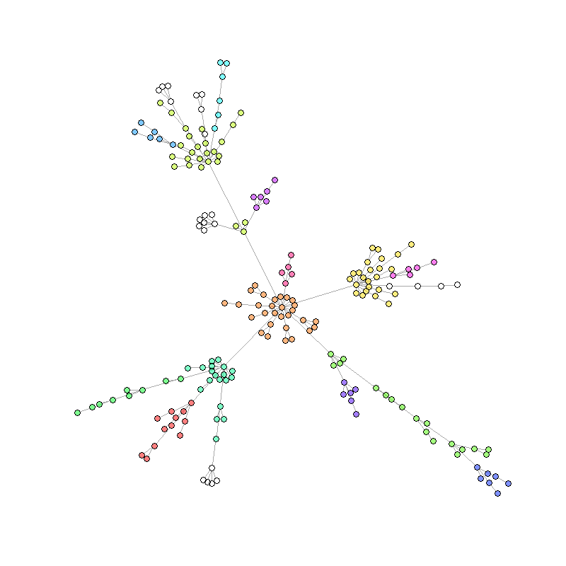
Visualize network using igraph package
It is also possible to use the igraph package to visualize a NetLogo
network. We use the nl_to_graph() function from the nlrx
package to convert our spatial data into an igraph object. Here we want
to display the network for only one simulation step, thus we filter our
spatial data and select only the last simulation step. Again, we split
the data into a turtles and a links tibble and rename the columns.
After conversion to an igraph object we can use the power of network analysis functions from the igraph package to do further analyses. In this example we perform a community cluster algorithm to color the nodes based on their community membership within the network.
## Load igraph package and convert spatial tibbles to igraph:
library(igraph)
nw.all <- nl_to_graph(nl)

## Select the last step and extract list element to get igraph object
nw <- nw.all %>% dplyr::filter(`[step]` == max(`[step]`))
nw <- nw$spatial.links[[1]]

## Perform community cluster algorithm and set community dependend colors:
com <- walktrap.community(nw)
V(nw)$community <- com$membership
rain <- rainbow(14, alpha=.5)
V(nw)$color <- rain[V(nw)$community]

## Plot:
plot(nw,
     vertex.label=NA,
     vertex.size=4,
     edge.curved=0,
     layout=layout_with_fr(nw, niter = 3000))